LR

I’ve worked as both a consultant and in-house designer, teaming up with cross-functional teams to design relevant, human-centered solutions. The projects featured below reflect a balance of creativity and strategy.
These days, I use AI tools to speed up the repetitive and labor-inetensive parts of design, which frees up more time to focus on the fun stuff, like experimenting with divergent ideas.




Bias is everywhere, even in the AI tools we use. That’s why it’s important to question those assumptions and avoid leaning on the same AI solutions everyone else is using. When teams understand the “why” behind their work and balance creativity with real-world constraints, they create smarter, more original solutions that genuinely resonate with users. This approach empowers teams to think bigger.
The work is important, but the people behind it matter just as much. I make it a priority to understand team culture, their unique challenges, and how new tools in the AI space can make everyone more effective. I’ve led small multidisciplinary teams and contributed to larger initiatives under inspiring leaders. At the end of the day, it’s about building strong relationships and creating work that’s designed to thrive in a fast-changing world.
Remote work continues to be just as effective when supported by the right tools. Platforms like Slack and Teams keep communication flowing and help maintain a sense of team culture, even across time zones. Tools like Figma, Miro, and even vibe coding apps make real-time collaboration seamless. With these in place, everyone can contribute and keep projects moving forward no matter where they are.
“Charlies depth of experience across industries as well as an amazing creative skillset make him unique in my experience in software.”
“Charlie's understanding of front and backend environments meant that all of his work was easily transferred to the development stage”
“We have happy clients across the Twin Cities because of Charlie's unwavering devotion to his craft.”

Please fill out the form below and let me know how I can help. You will get a response within 24 hours.
Revel is an online learning platform that provides its users with a seamless blend of author-created content and assessments based on learning science. The application recently underwent a complete redesign from both a visual and strategic perspective. The business was concerned about attrition rates going up due to the differences between the legacy and updated product and requested an onboarding experience that would guide users through the updates.
I was the lead on this initiative and collaborated with a team of designers, scientist, researchers, writers, and engineers. We conducted workshops with onsite and remote attendees, held weekly critique sessions, and shared our progress early and often with stakeholders for continuous feedback.
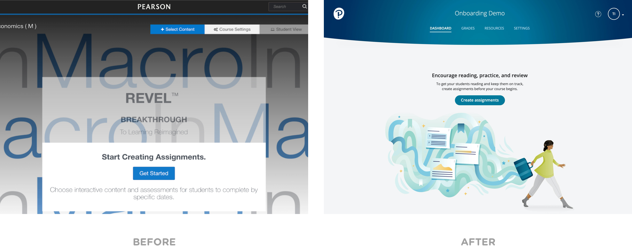
Below are screen captures of the before/after version of the product. Since Pearson was planning on phasing out their white glove experience with its new and returning customers our onboarding strategy needed to not only guide them in the setup process but also address the cognitive dissonance that is likely to occur.
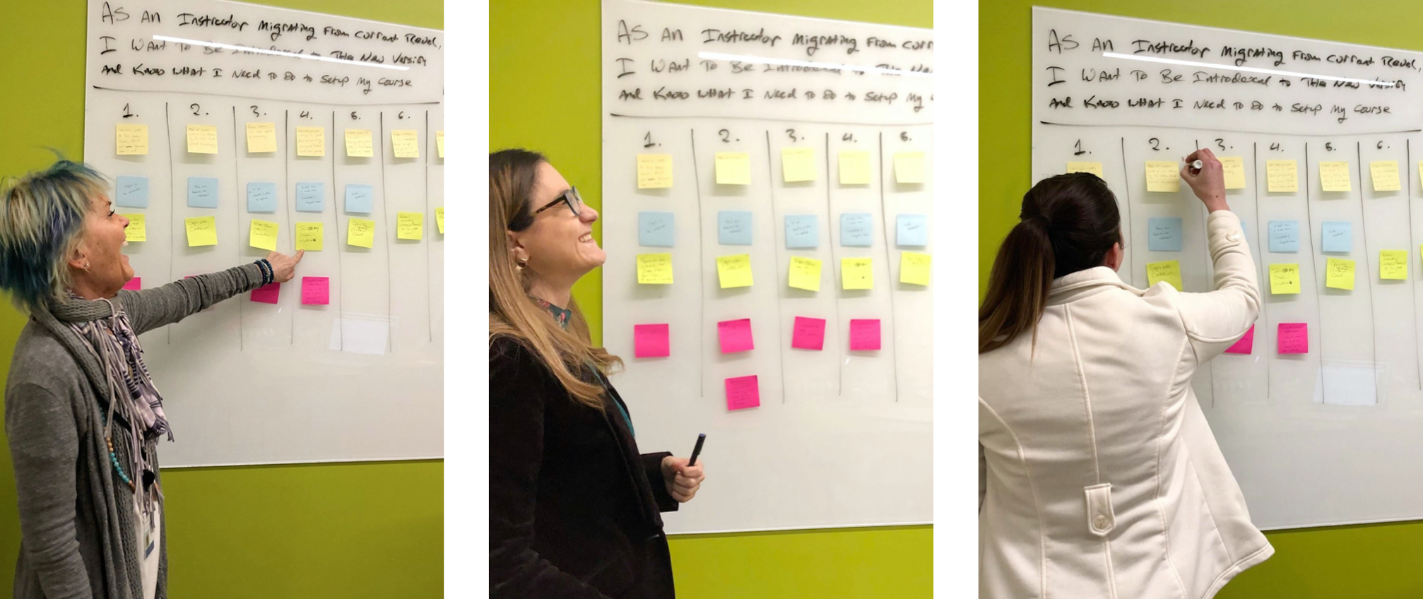
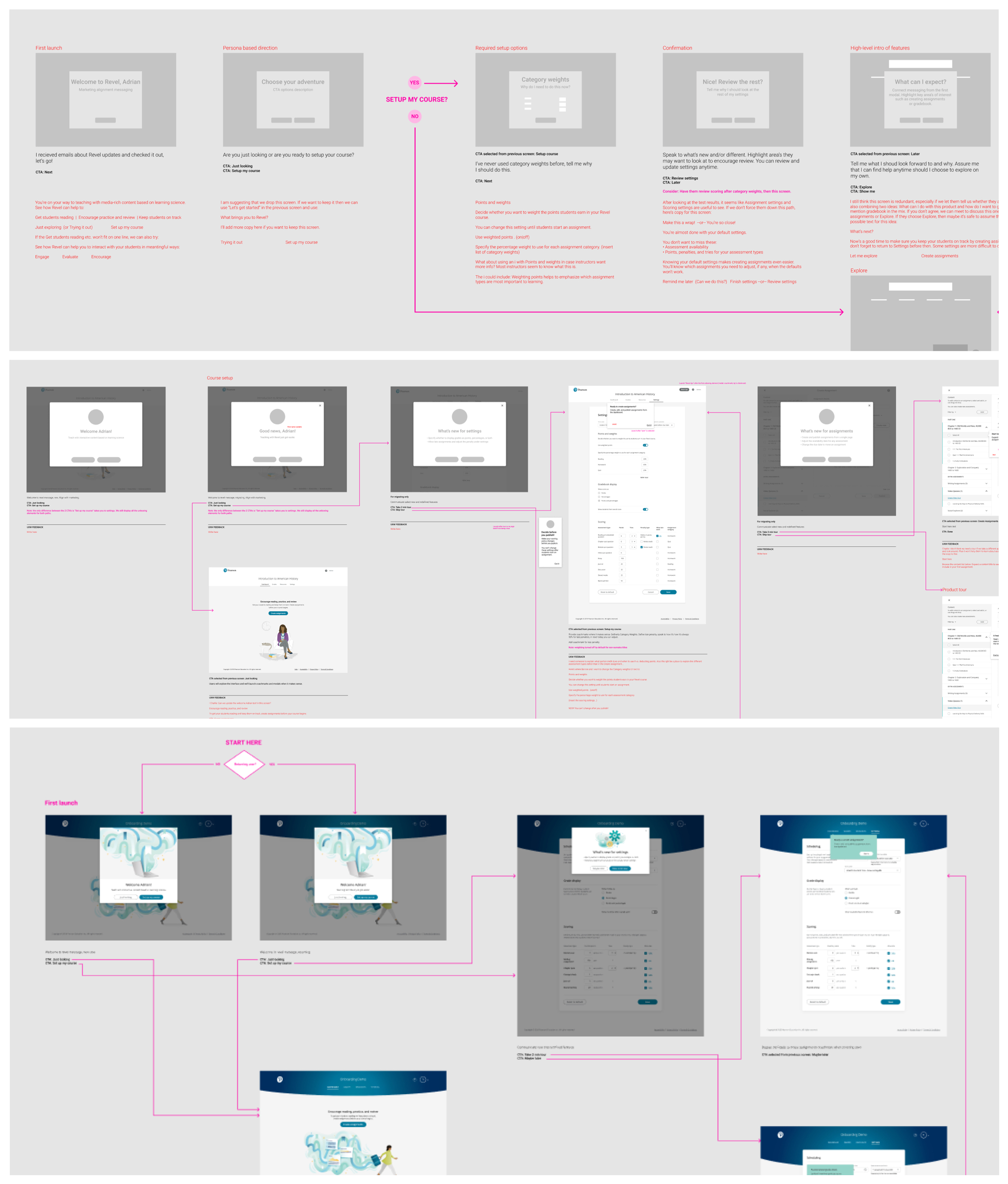
Our team was small to start, and we didn’t want to get too ahead of ourselves knowing that others would soon join in on the fun. Since it was requested to get the ball rolling we kicked things off with a simple story mapping workshop. We had two primary goals the business wanted us to solve for: reduce attrition rates and encourage new behaviors based on the KPI’s.
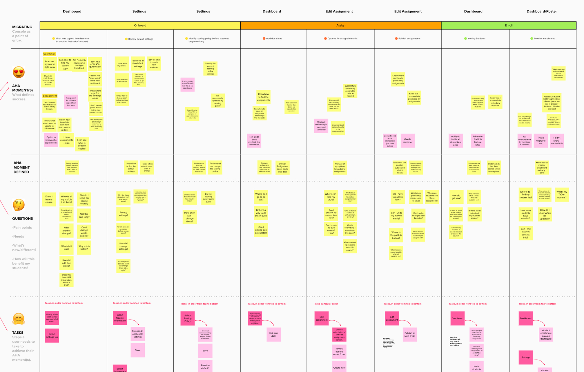
We synthesized our findings from our story mapping session and translated them into user journey categories. Now that we had the full team engaged, we gathered additional perspective on how they imagined our customers would navigate the product. We grouped like input into categories and arrived at a consensus on what those “aha” (success) moments could be for our users.
Now that we had a shared understanding of the opportunities to solve for, we diverged into our respective disciplines, came up with ideas, and converged as a team to discuss. We then collaborated in a shared document and took an iterative approach in developing wireflows to inform the end/end experience that we’d test with customers.
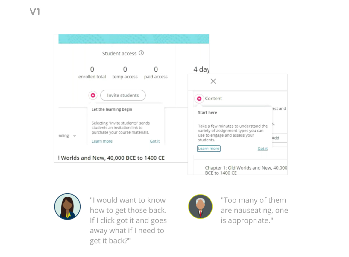
We developed 3 variations of our onboarding experience. The first version was really about confirming the assumptions our team aligned on in the workshops. We placed a series of “hotspots” in the experience to discover which ones users would engage in. The solution wasn't a hit, but we did learn where we needed to refine our approach.
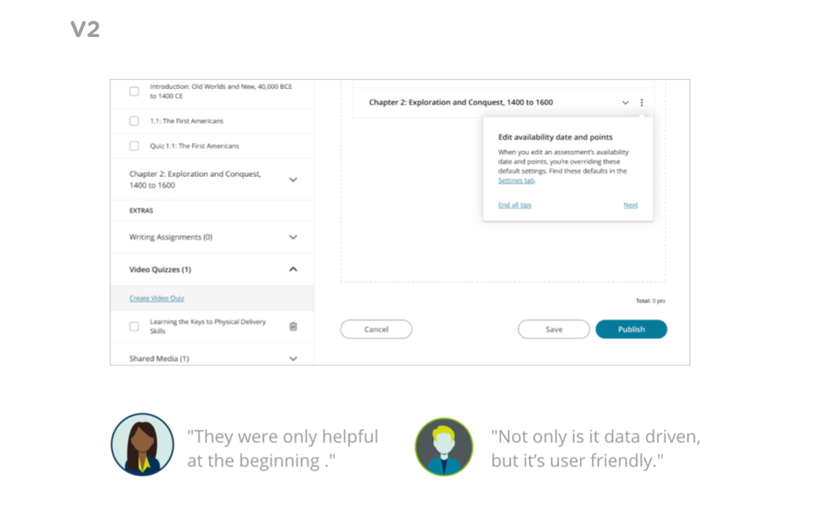
We took the learnings from our first test and placed messaging only where it was needed. The hotspots were replaced with messaging that launched as the user navigates. This approach was closer to achieving our intended outcome, but still didn’t hit the mark. We had to find a better way to provide greater control over their experience.
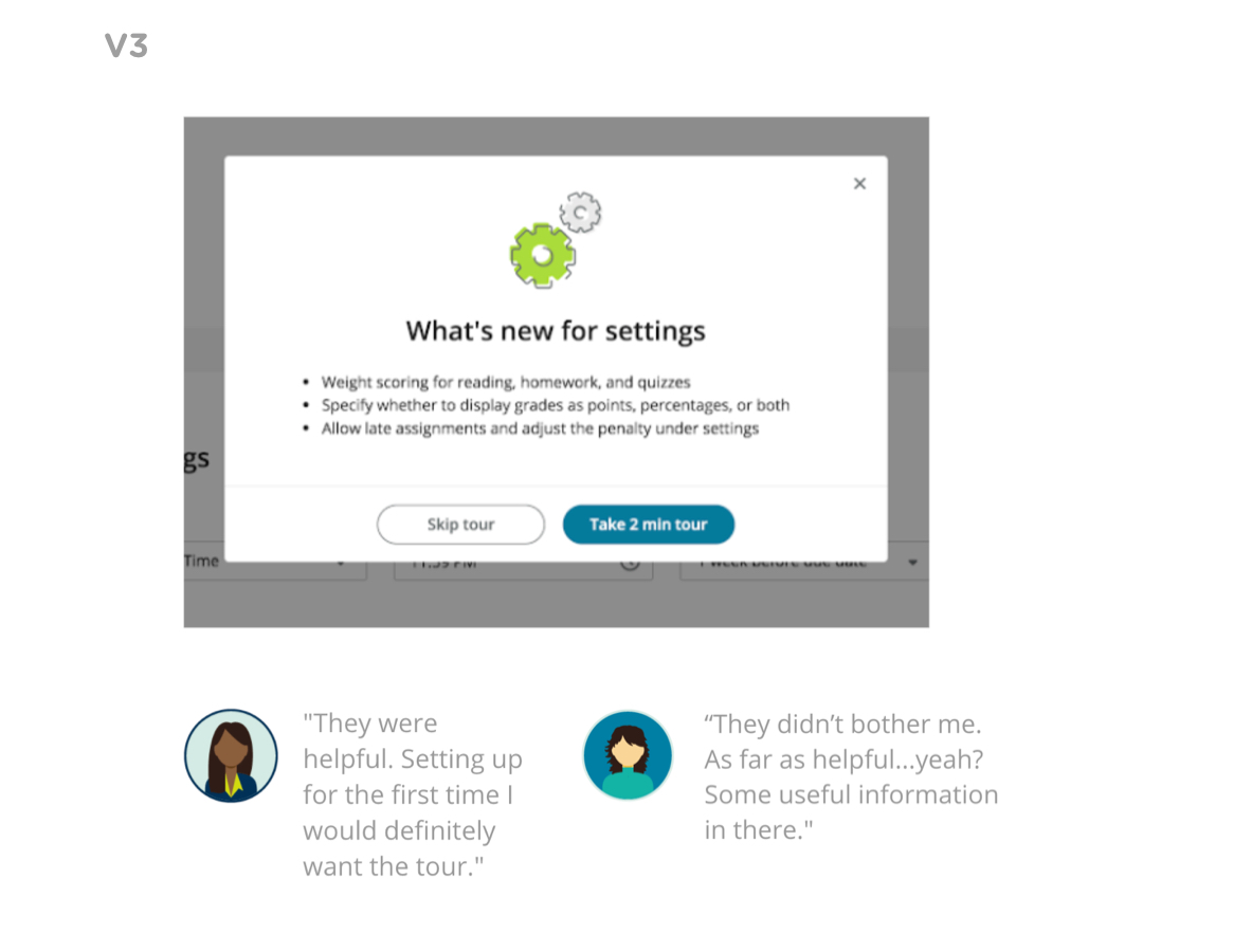
Our final round of testing involved asking permission and setting expectations before displaying any additional guidance. By doing so we observed that not only were users more receptive to the experience should they take the tour, but also likely to retain what they learn. A win/win for the business and its customers.
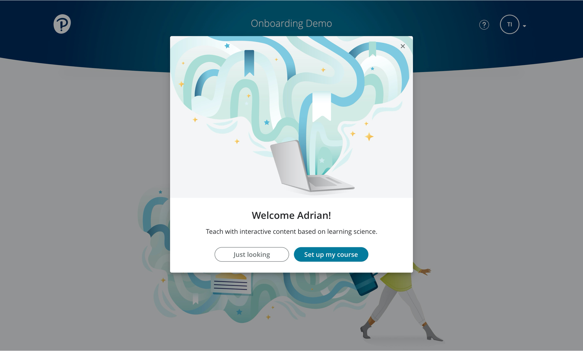
Experiencing anything for the first time can be a daunting experience. Through research we discovered that not everyone uses our product in the same way. We needed to ensure that we met customers where they’re at in their journey. At first launch we greet our users and ask how they want to proceed.
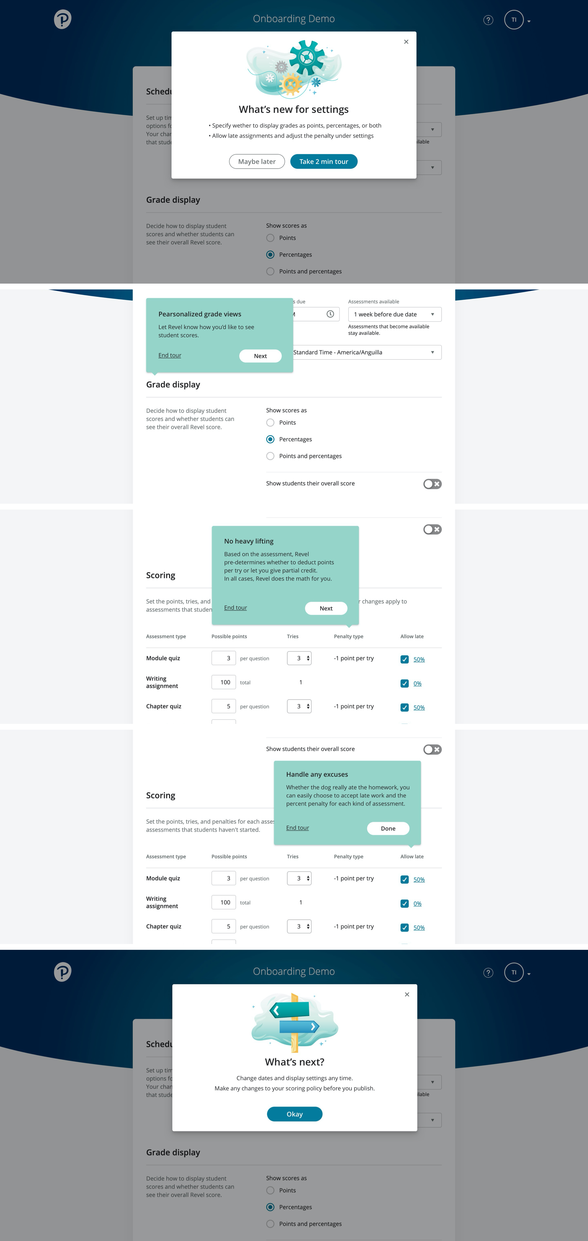
We learned from testing that if we delivered guidance before the user was ready that information would get lost. In this example we only deliver the tour for settings when the user navigates there. Copy played a big role with catchy headlines and a summary of what’s new should they decide to forgo the tour. Since our customers are busy instructors we also set the expectation in our CTA that these tours will only take 2 minutes.
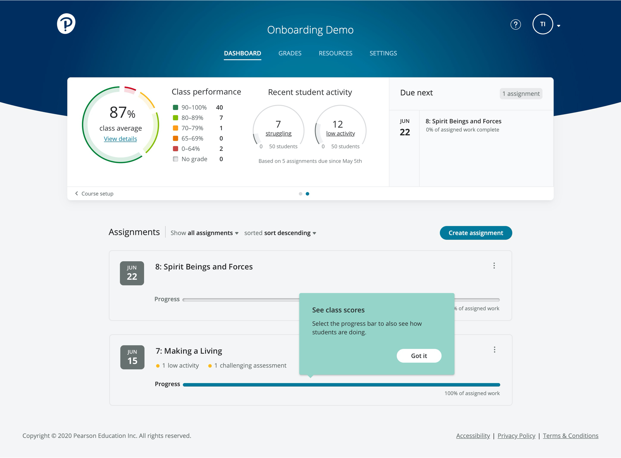
Another objective that the business wanted us to tackle, and a good one, are ways that we can engage customers throughout the use of the product. We continued to leverage our strategy of meeting them where they’re at by displaying guidance as the interface evolves. In the example below, we let instructors know that there is data to review now that their class completed the assignment.
The outcome of this work was far-reaching. While it's still too early to tell if the work will be a success with customers, what it did accomplish was wide-spread adoption through the org as a best practice for other onboarding efforts.
There’s a lot more to show, including how some of the usability testing performed influenced the thinking + features that went into this work. Feel free to setup some time by getting in touch through the contact form on this site or email: ctetro@chrlieco.com
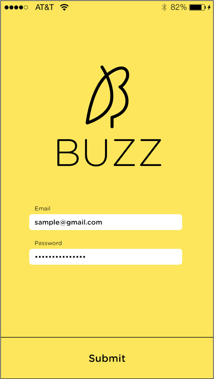
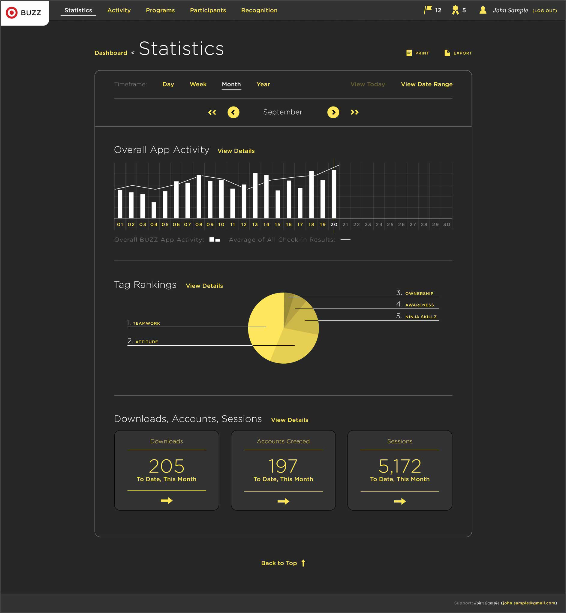
A social recognition app targeted to in-house employees with the idea that by engaging in their workforce you will earn their loyalty, and keep it for years to come. Employees and managers alike are enabled to show appreciation and emphasize that the work they're doing as a whole really is making a difference.
I collaborated with a team of engineers, user experience, and product management. I mostly worked on the UI but also participated in planning meetings, developed graphics, and documented specs for IOS and Android.
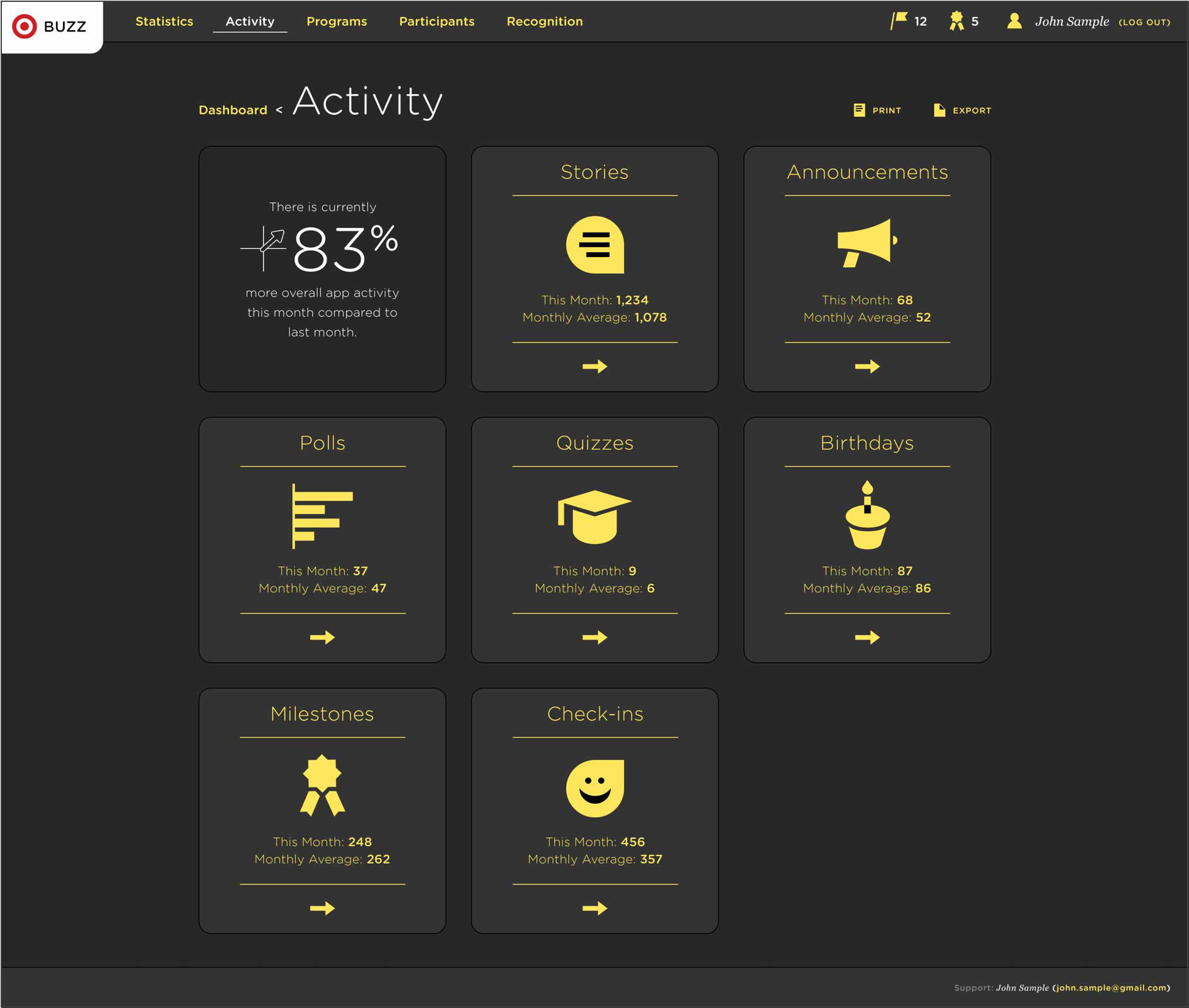
Some of the features include posting stories, taking quizzes and polls, announcements, celebrating milestones, and even track happiness at work. The more employees interact with the app, the smarter it gets.
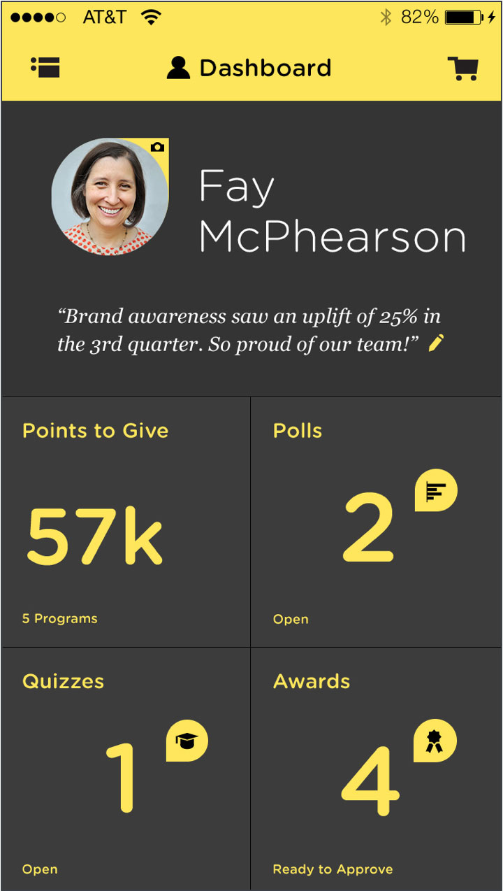
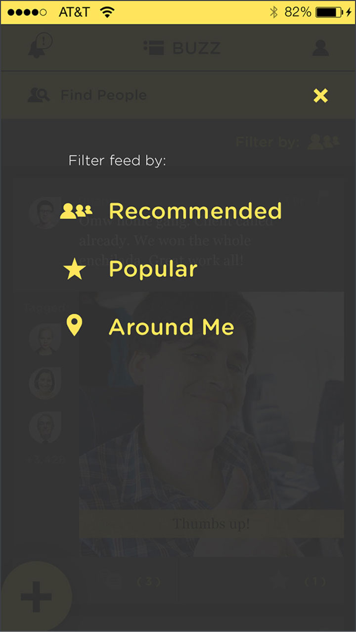
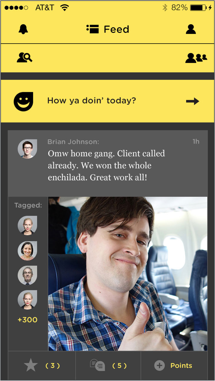
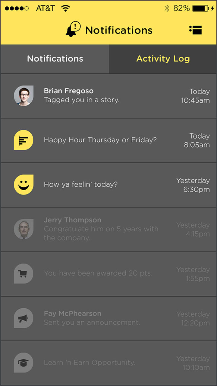

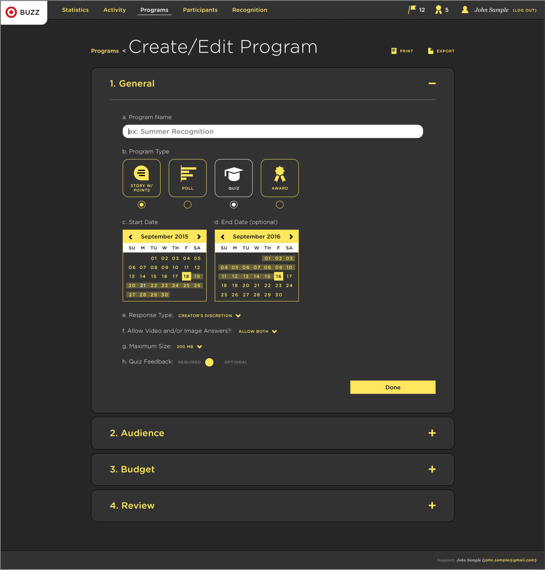
Managers can keep track of all app activity through the admin site. Access activity details, create/edit programs, monitor statistics, track employee involvement, and more.
Feel free to setup some time by getting in touch through the contact form on this site or email: ctetro@chrlieco.com
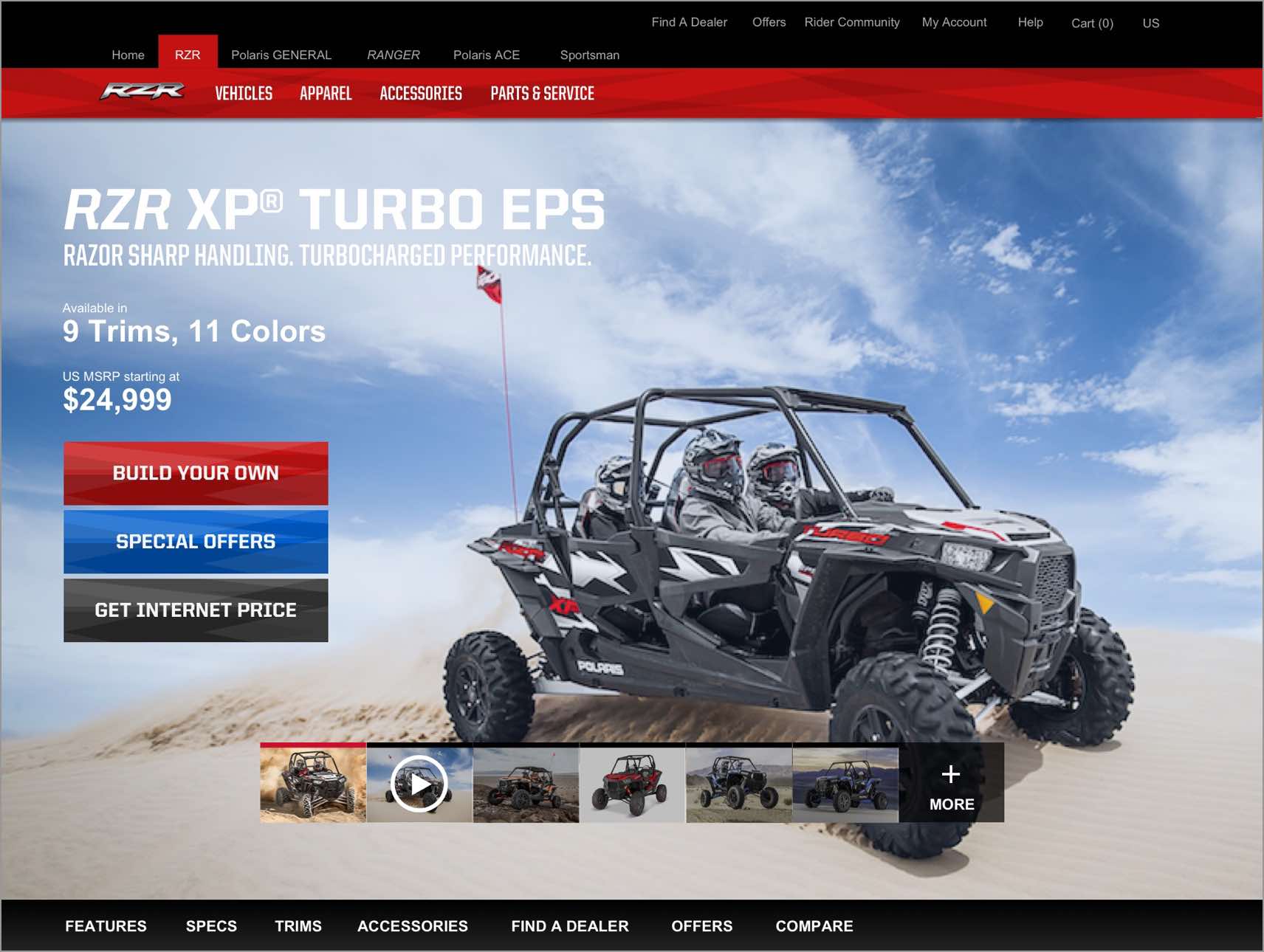
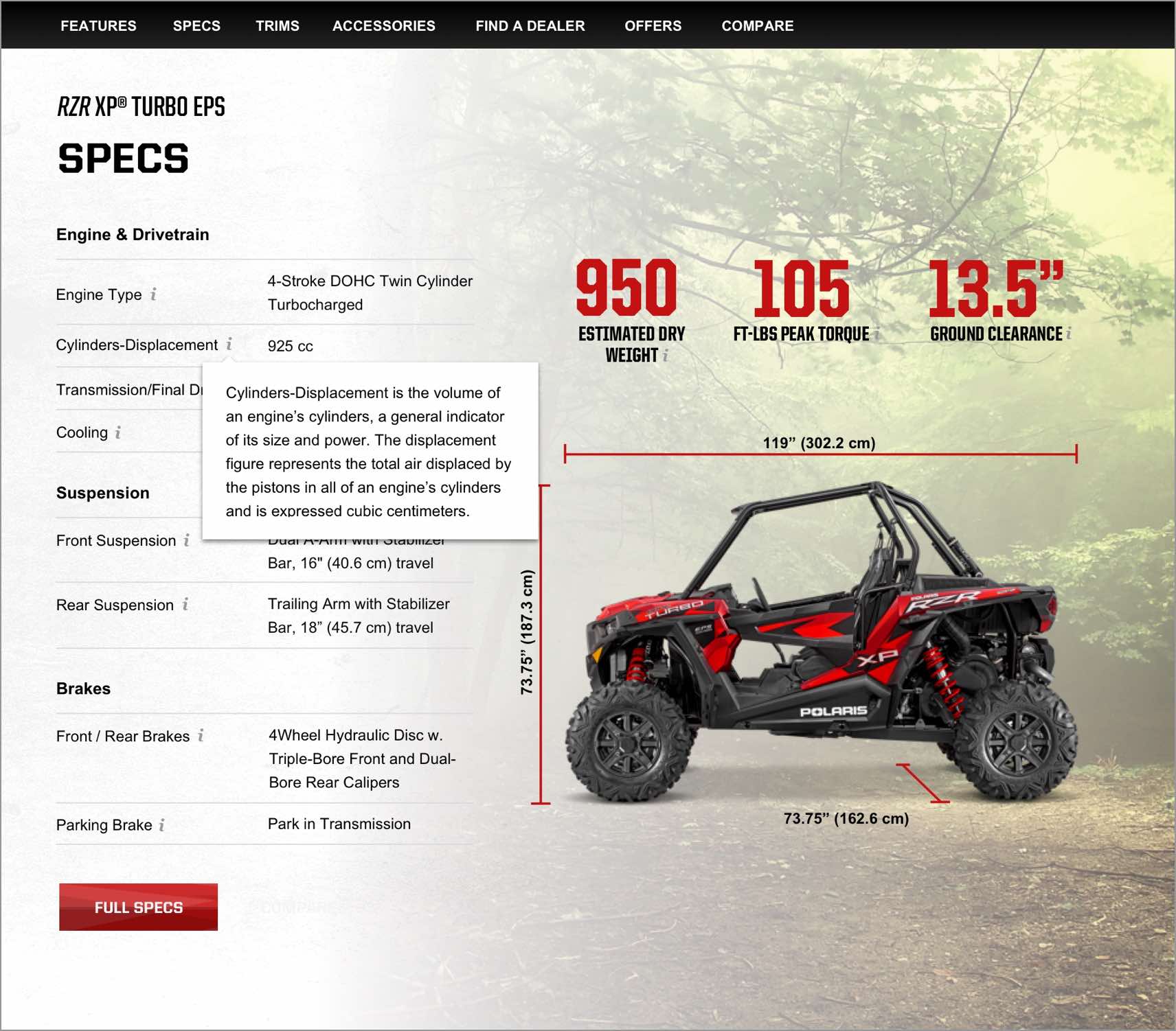
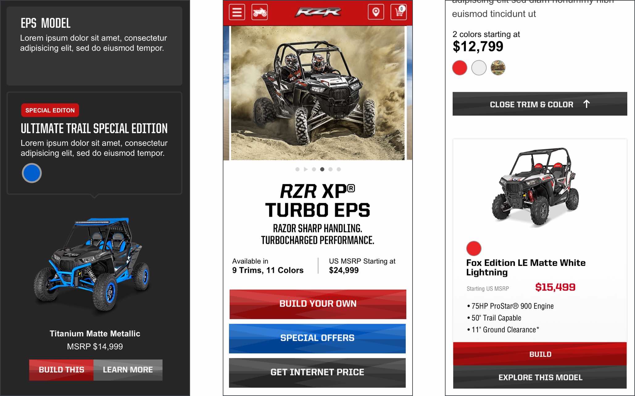
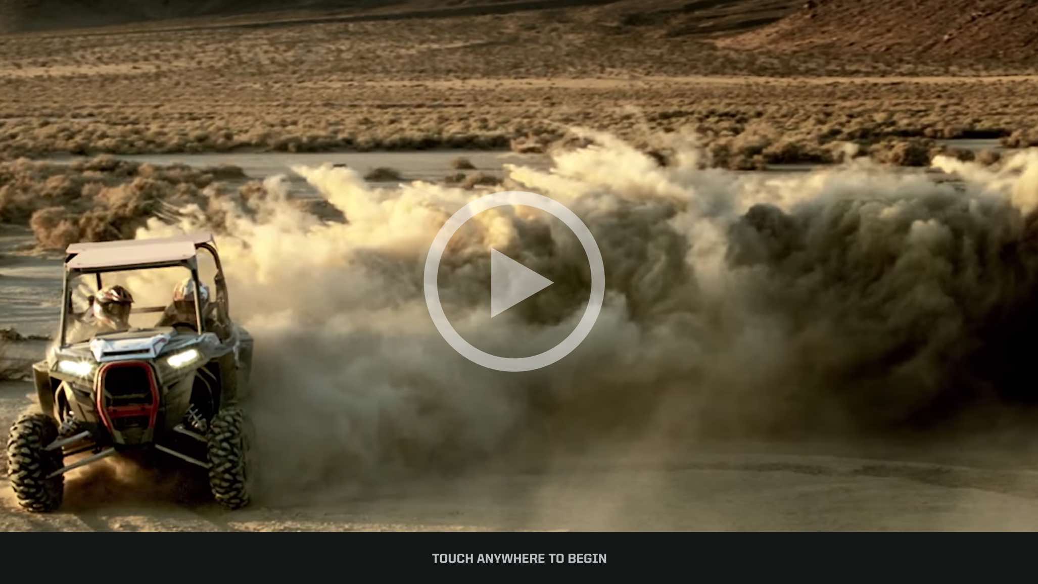
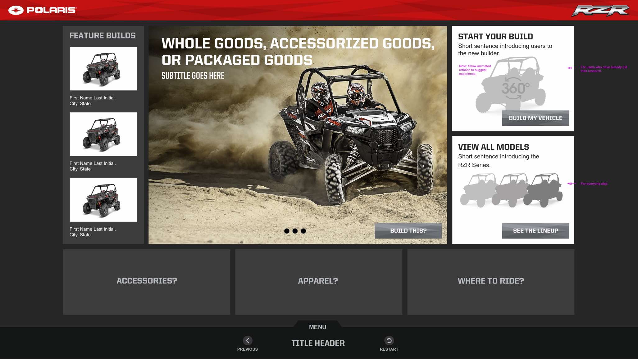
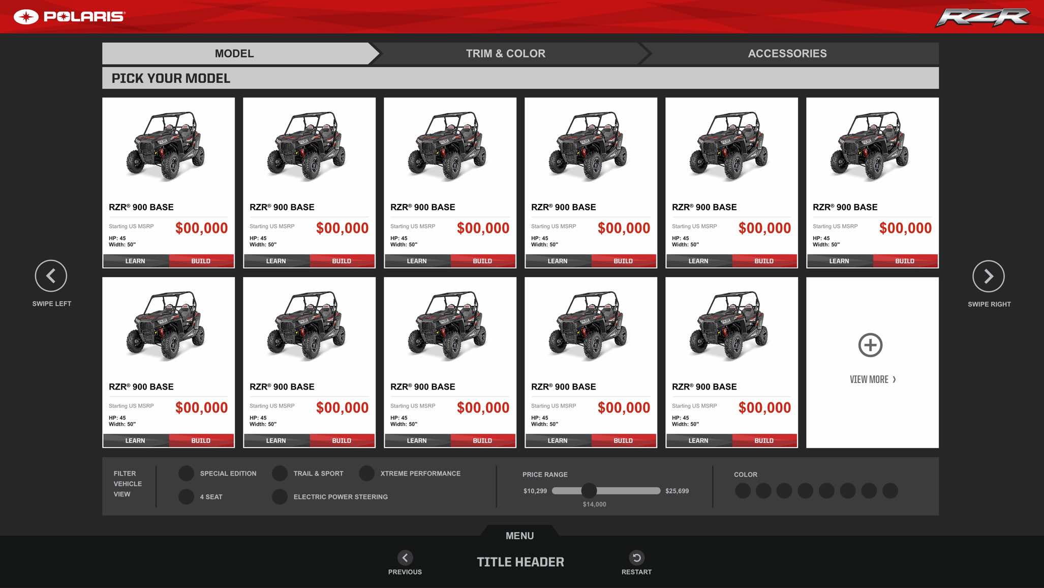
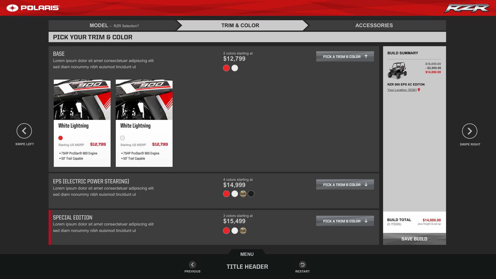
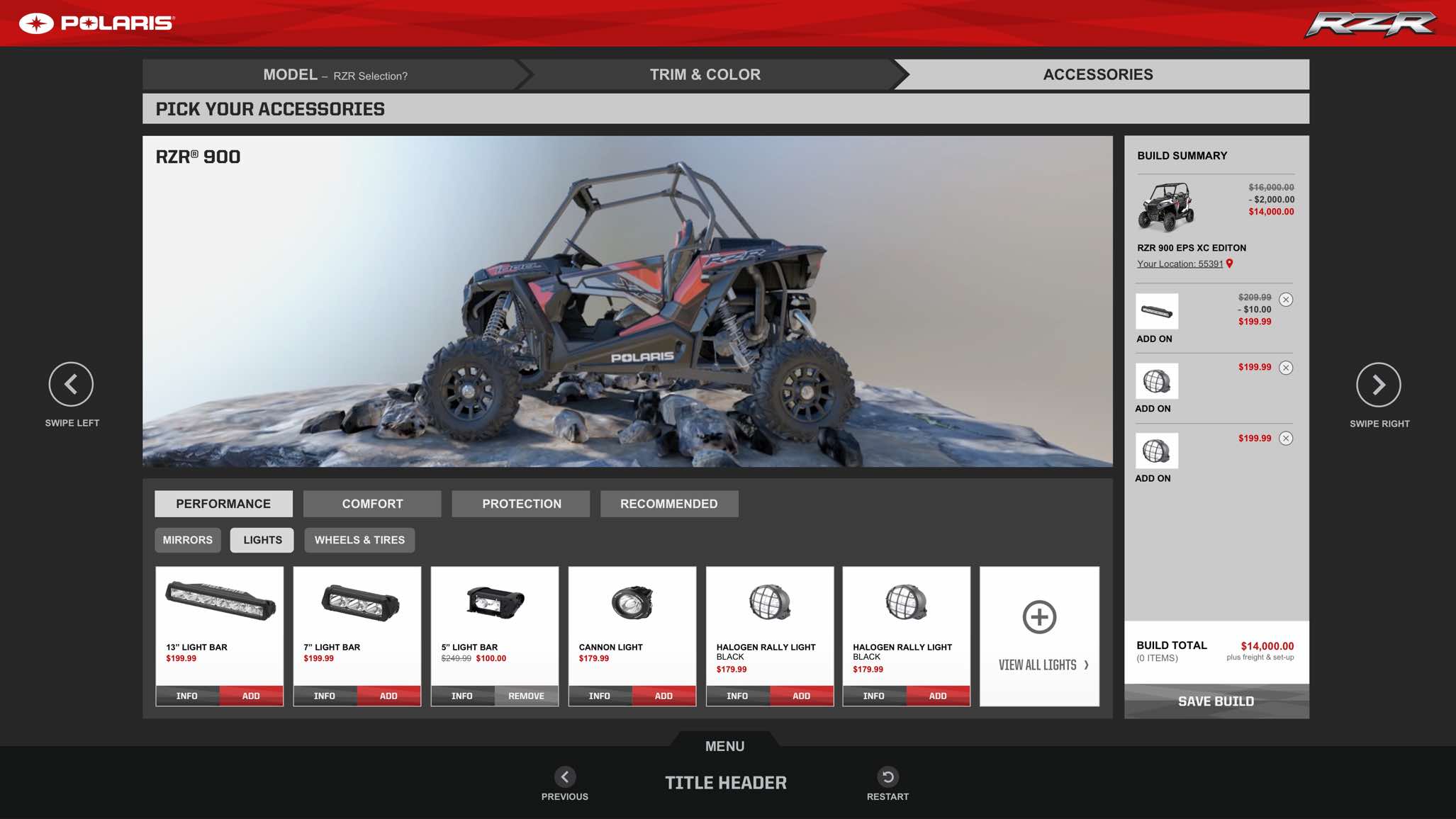
Polaris hired me to help them create a 55" touch screen experience for their dealerships. The functionality for this interface was intended to compliment their online vehicle builder. High level features include the ability for users to upload their custom build from their device to the touch screen, build additional vehicles in-store, and integrate a "where to ride" tool that displays the best trails for their vehicles.
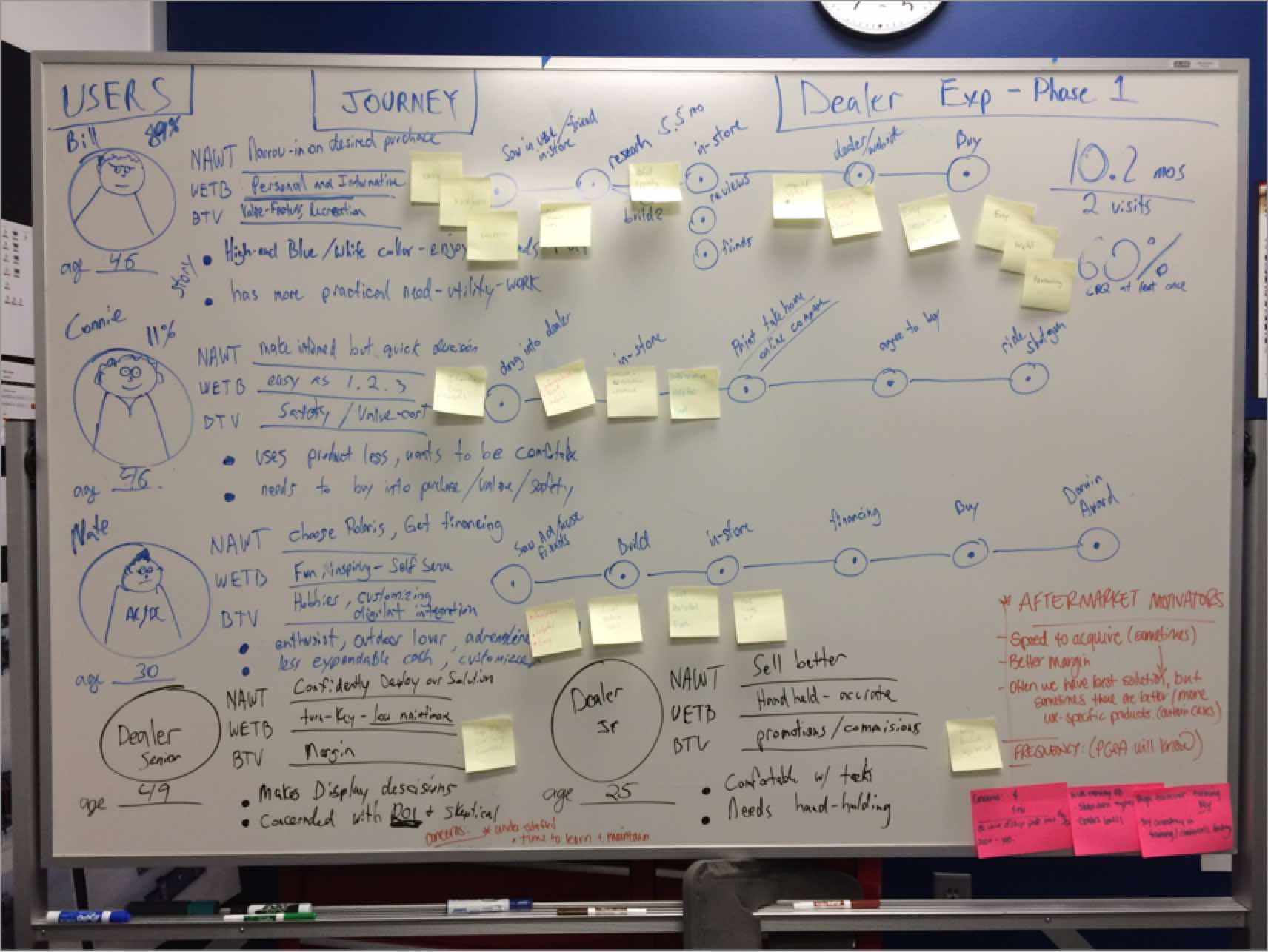
I partnered with Polaris's design and engineering team to explore multiple options for the dealer touch screen experience through a series of workshops. I helped in establishing personas, user research, business requirements, whiteboard sessions, hi/low-fi sketches, and sitemaps.
Polaris's learn and build tool is intended to help customers better understand their product lineup with the ultimate goal of allowing users to customize a 3D vehicle build online. I was asked to help develop a dealership touch screen experience that expanded on the functionality of their site.
We kicked things off by inviting teams from multiple departments to participate in a series of design sprint workshops. Our meetings were structured around understanding how the requirments of the business can align with the needs of their users.
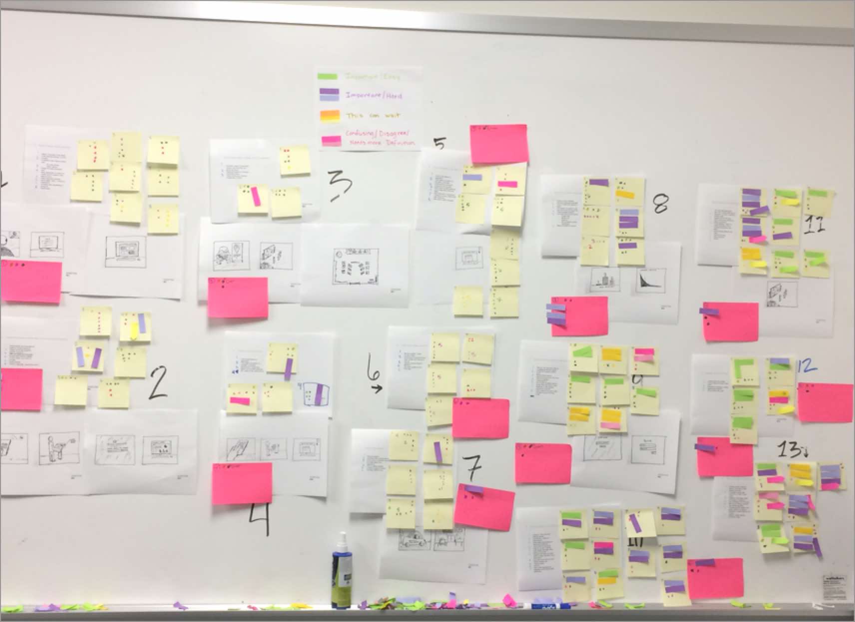
With limited space and busy schedules we found it challenging to keep some people involved in our design sprints. As a team we adapted our process by utilizing google apps to gain valuable feedback from stakeholders on their schedule.
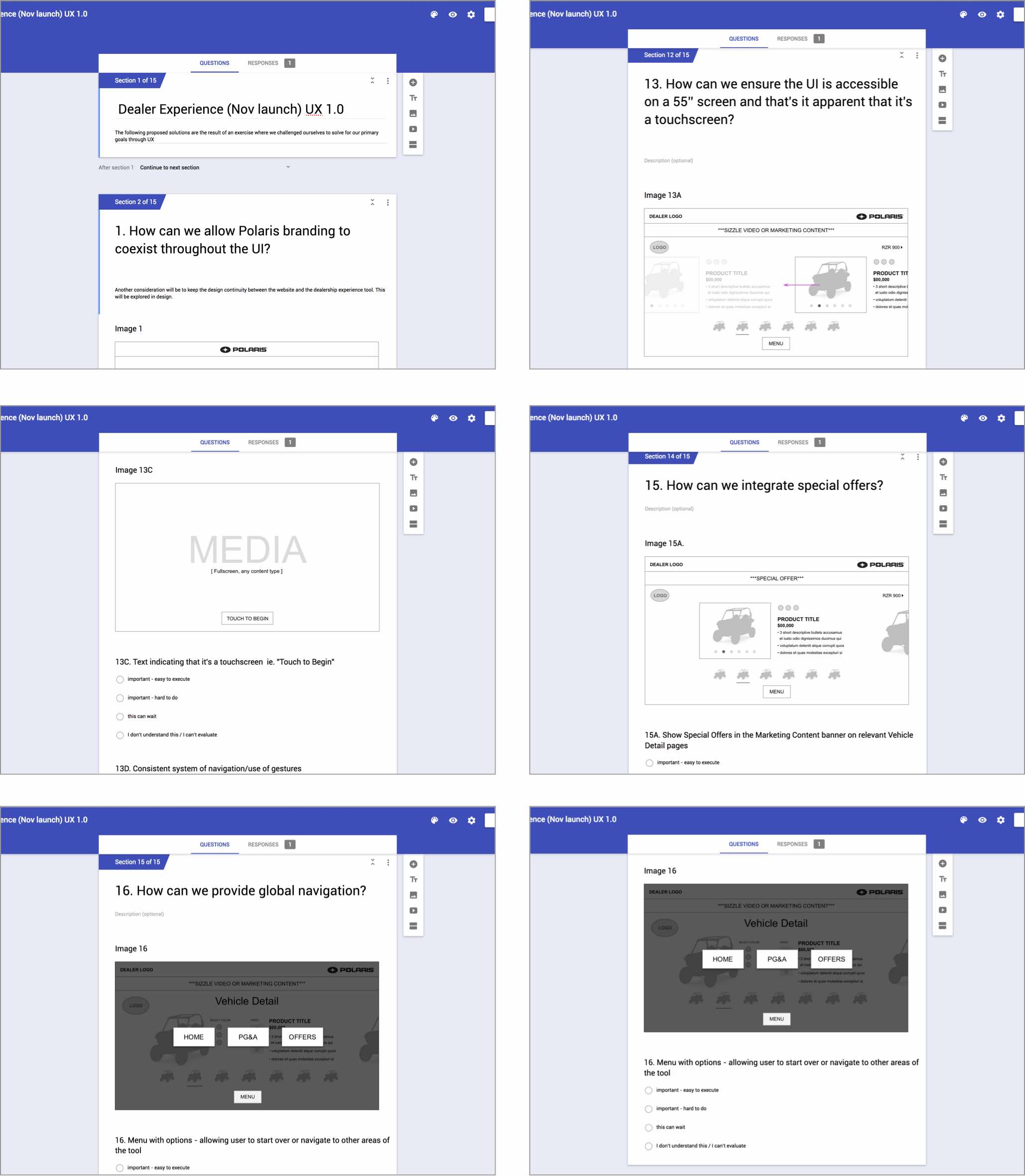
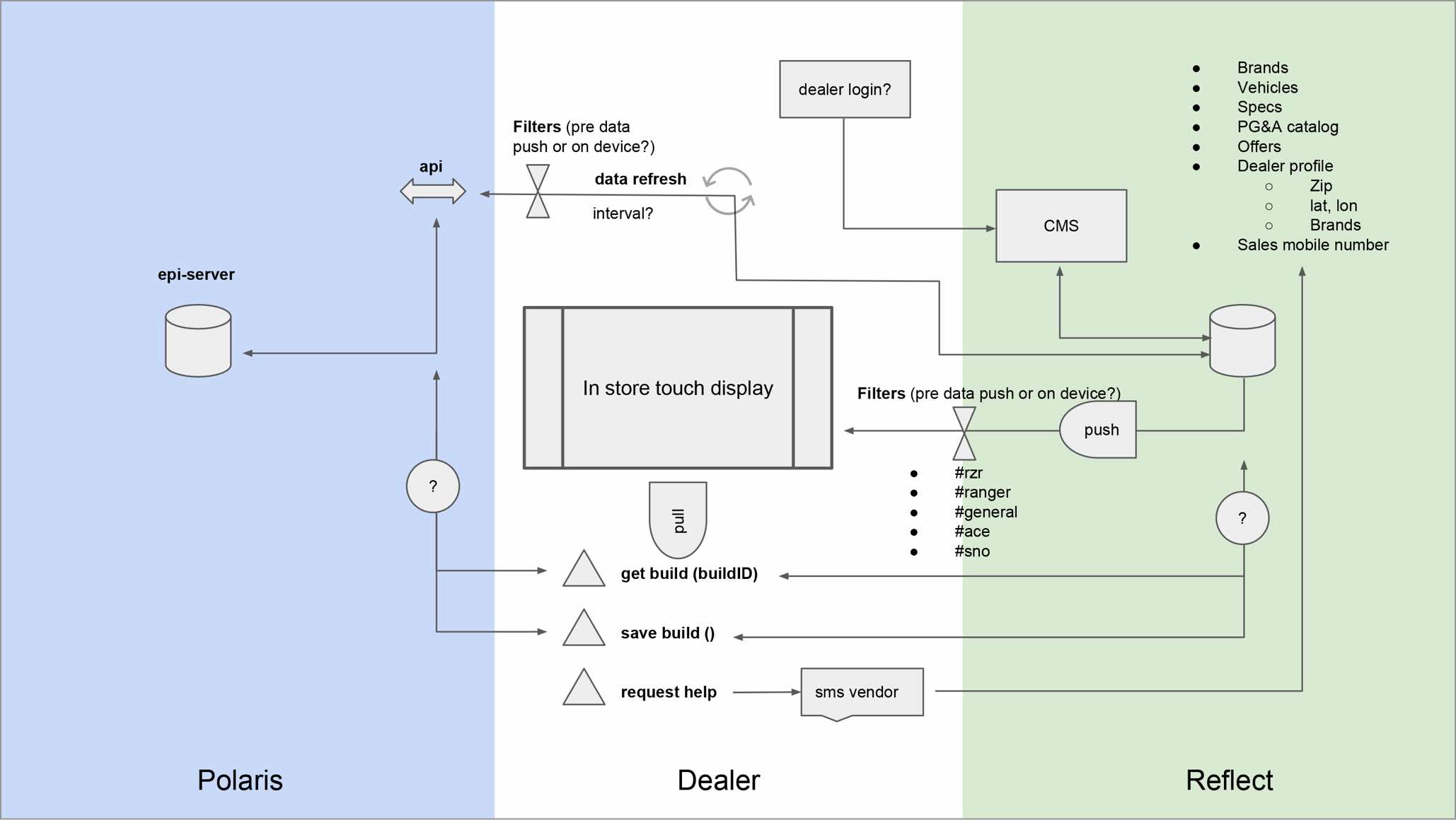
We prioritized our strongest ideas and eliminated solutions that couldn't be pursued. Here is an overview of how our findings fit into a system that can be communicated across channels.
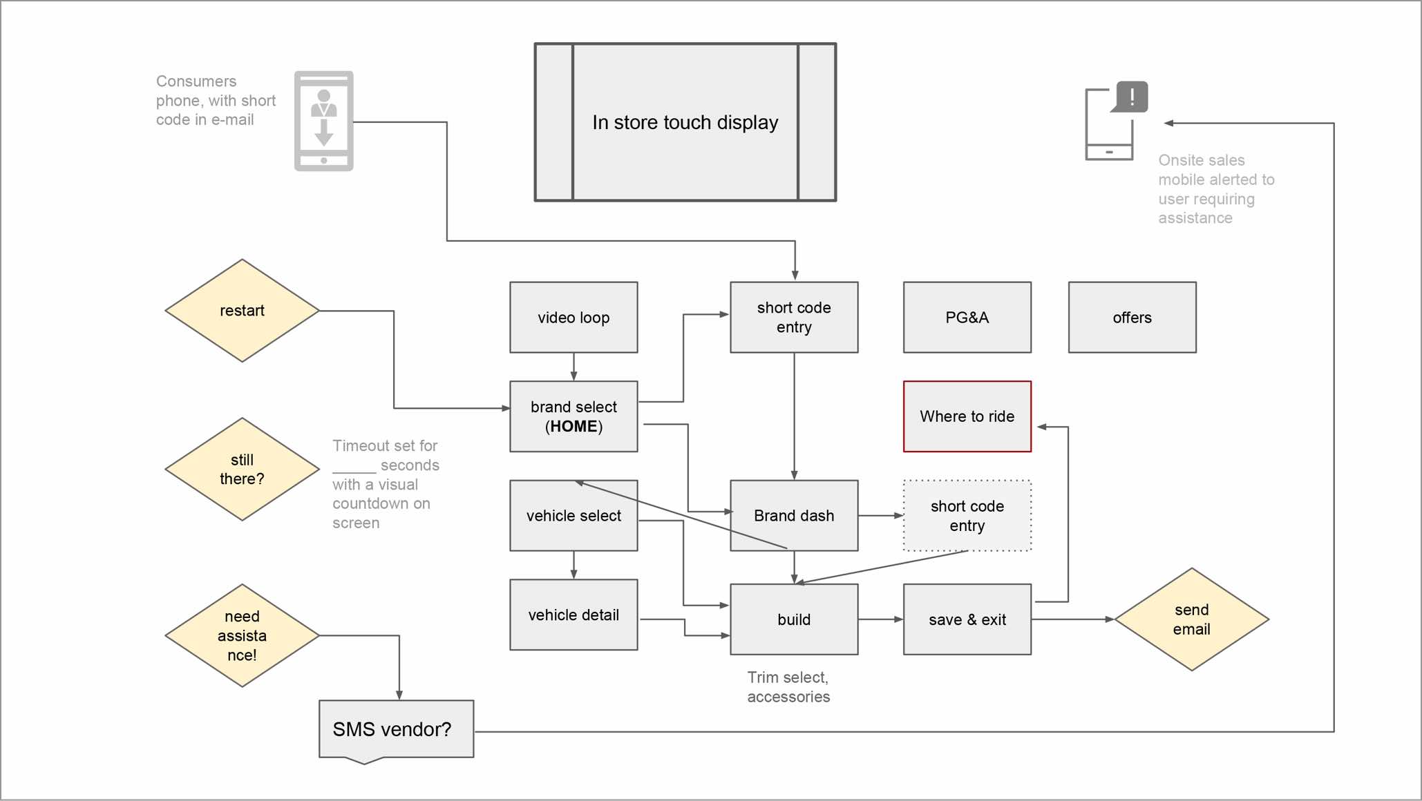
Paper prototypes were initially developed and reviewed by the team. We utilized a combo of stakeholder input and service design thinking to land on the right direction. My involvement with this project concluded with the development of hi-fi mockups for stakeholder presentation and design/engineering hand-off.
The outcome of this work was a better understanding of the market for the business to reliably invest in the next stage of this project. It also paved the way to improve the relationship between the online and in-store experience with customers.
Feel free to setup some time by getting in touch through the contact form on this site or email: ctetro@chrlieco.com
Discount Filter Store needed an easy way to help customers find the products they need with an advanced search feature. The process had to be fast and intuitive with the least amount of steps taken. They also wanted to rework their product description page to better reflect inventory, up-sell larger quantities, and cross-sell their own product line when appropriate.
I worked mostly off-site while collaborating with the owners and their team. I advised on best practices in ecommerce, created wireframes for review, designs for A/B tests and the final product.
The business wanted to provide their users a mobile-friendly way to narrow their search with visuals to inform a selection. Once a category is chosen, the finder will load relevant options highlighted under each category. The category in the tag is then replaced with the user's selection and changes to blue. This process repeats until the finder identifies a match. If an error is made the user can scroll up, tap a previous selection, and make a new one.
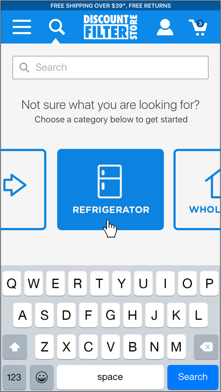
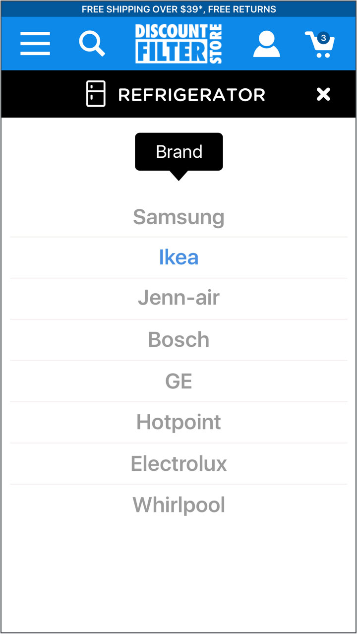
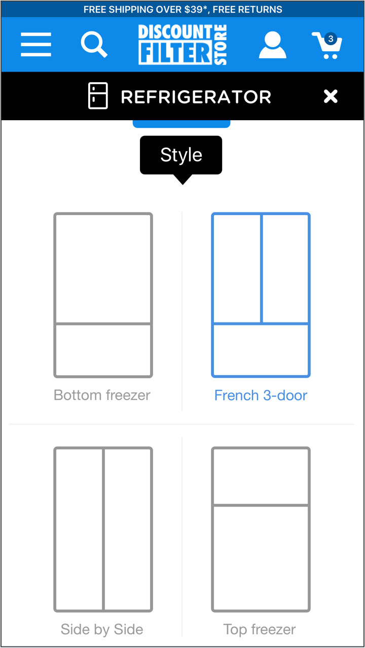
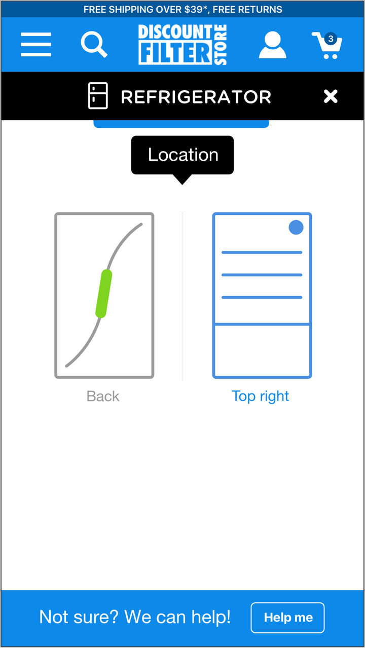
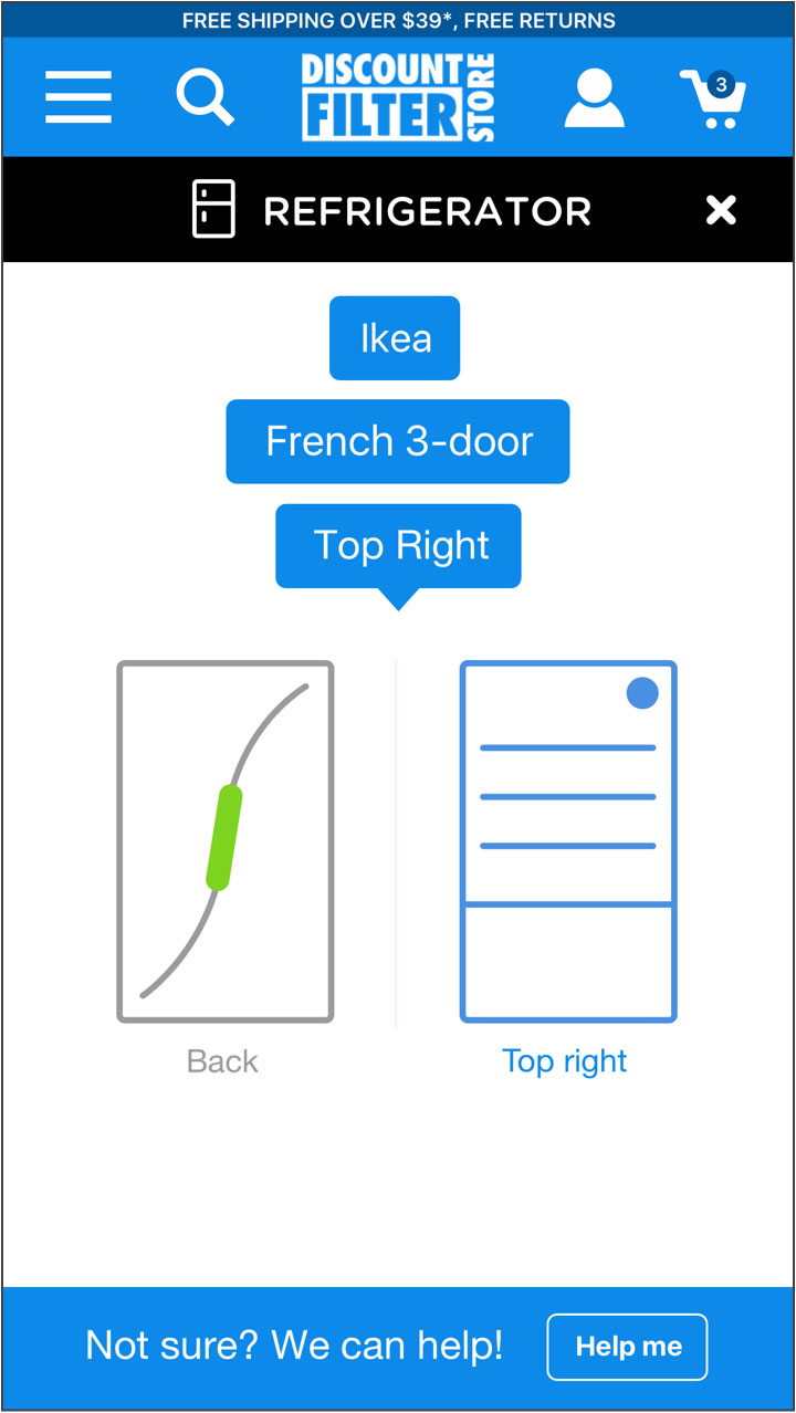
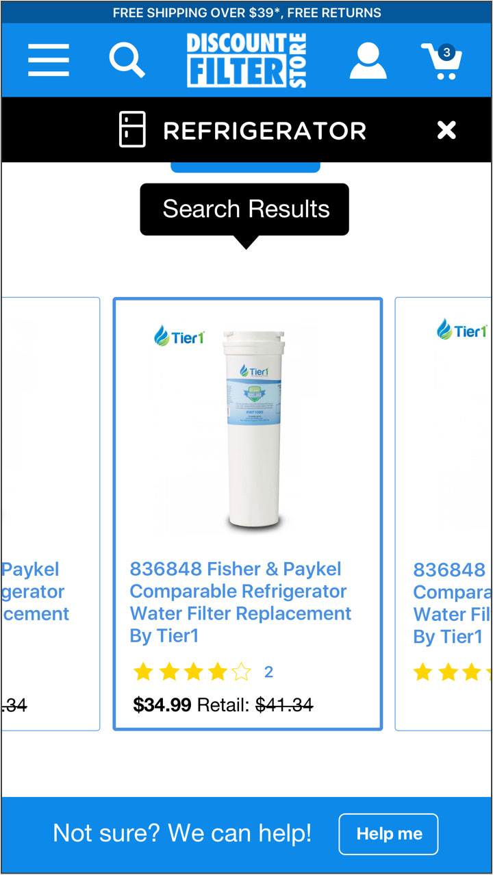
Many brand name products on their site have a comparable product produced by the supplier. A counter offer is strategically placed above the price to nudge consumers to the supplier brand. Options for order quantity and frequency we're also refined to better reflect the company offering.

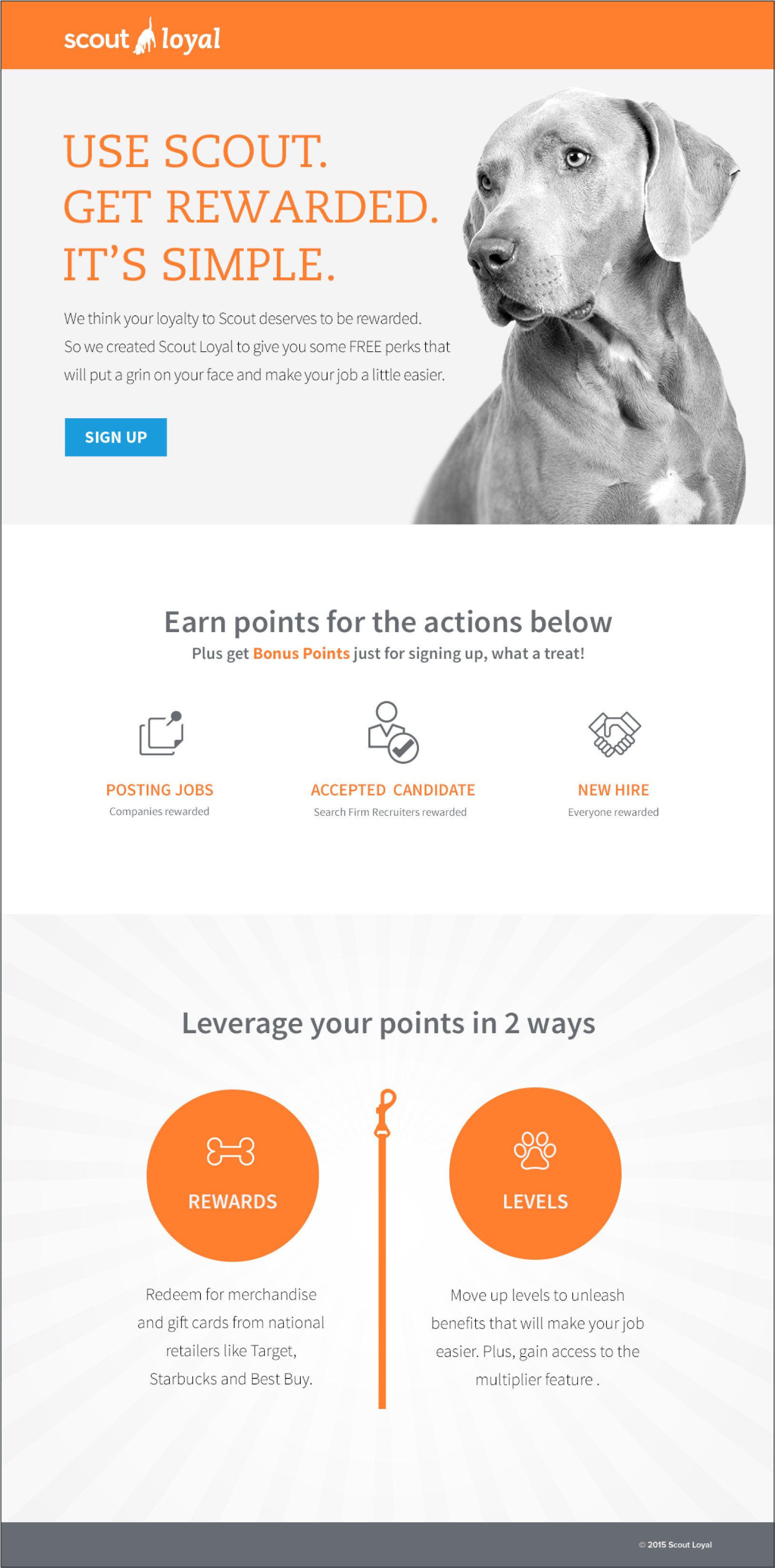
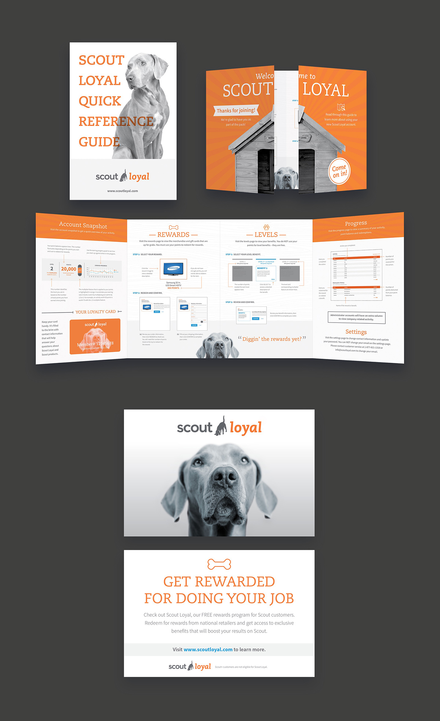
Scout needed a way to incentivize their employees by getting more recruiters to sign up for their services and grow its use among current customers. The solution was a rewards program that would increase visits to their site and use of their services. Scout Loyal features flexible rewards that are attractive to both recruiters and the companies they work for, and provides ways for Scout to show current customers they are valued.
I worked mostly on-site to lead and mentor a small agency team. I was responsible for creative, wireframes, high-fidelity prototypes, client presentations, final layouts, and style guides.
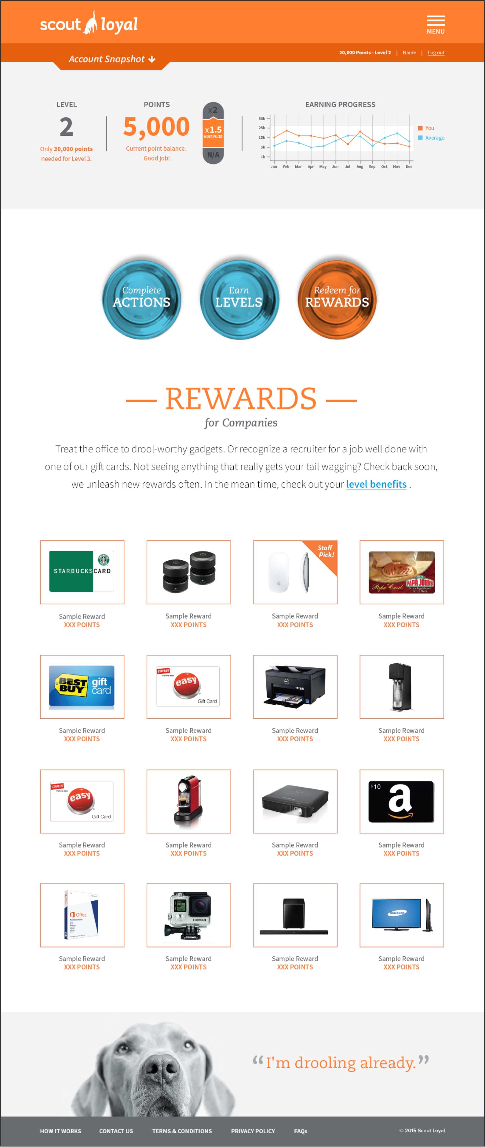
This site features a tutorial that outlines all program features, a system for tracking employee progress, and a method of earning rewards for a job well done. Users redeem earned points for rewards that can be assigned to employer/organization or individual recruiter. There is also a dashboard that displays user level, points earned, and a report that compares earning progress to program average.
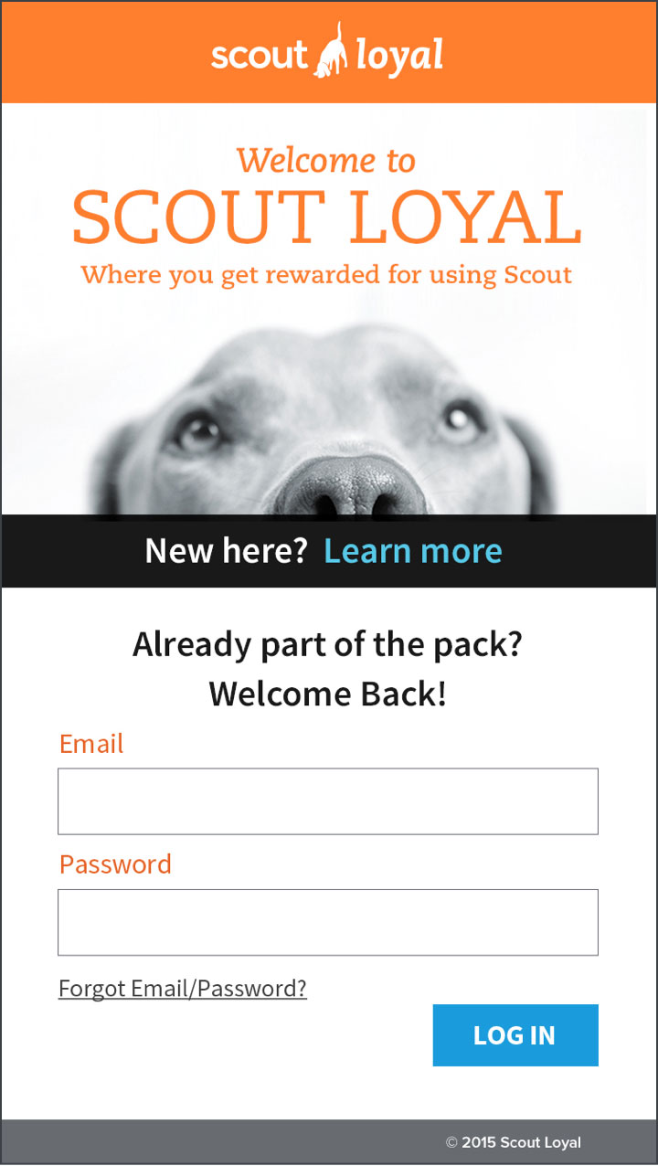
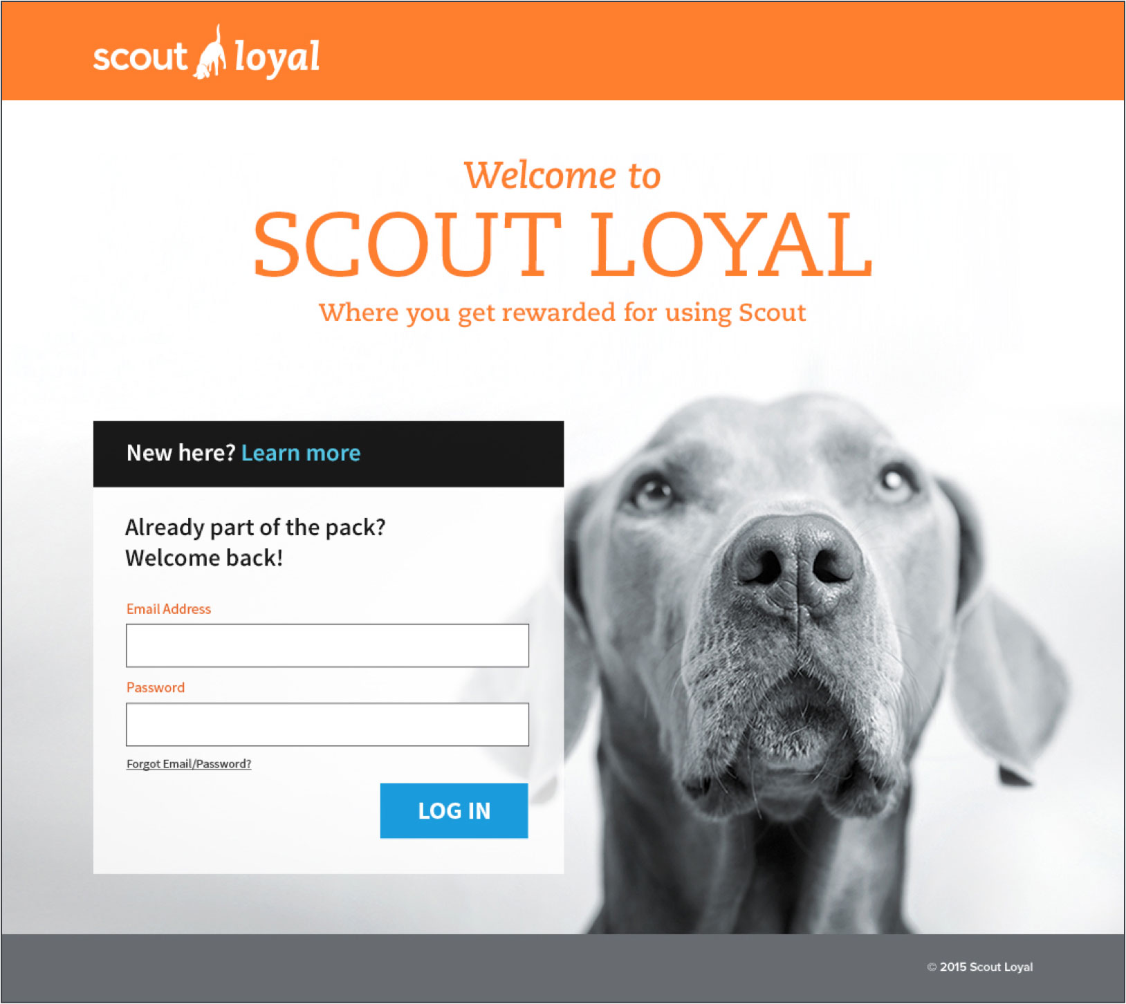
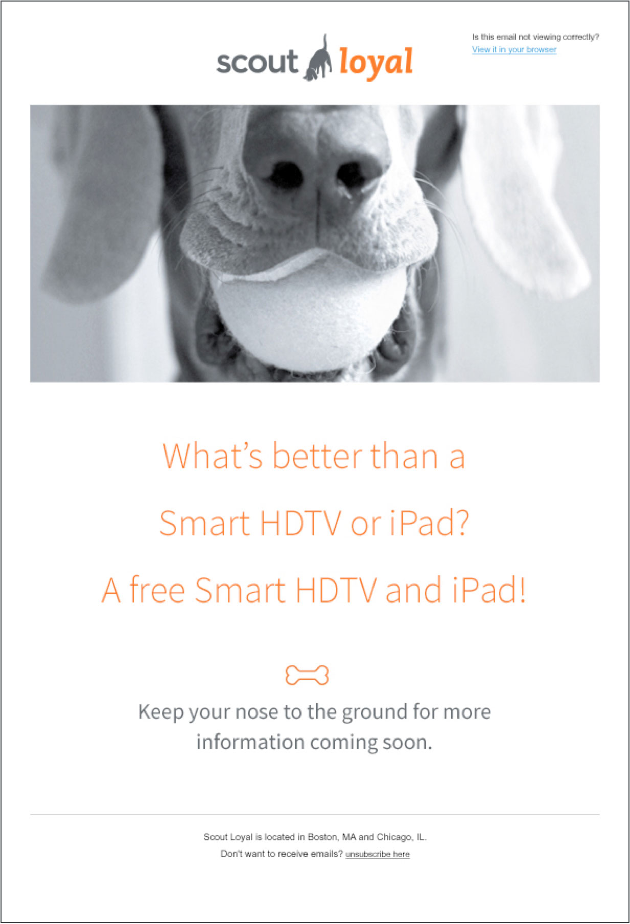
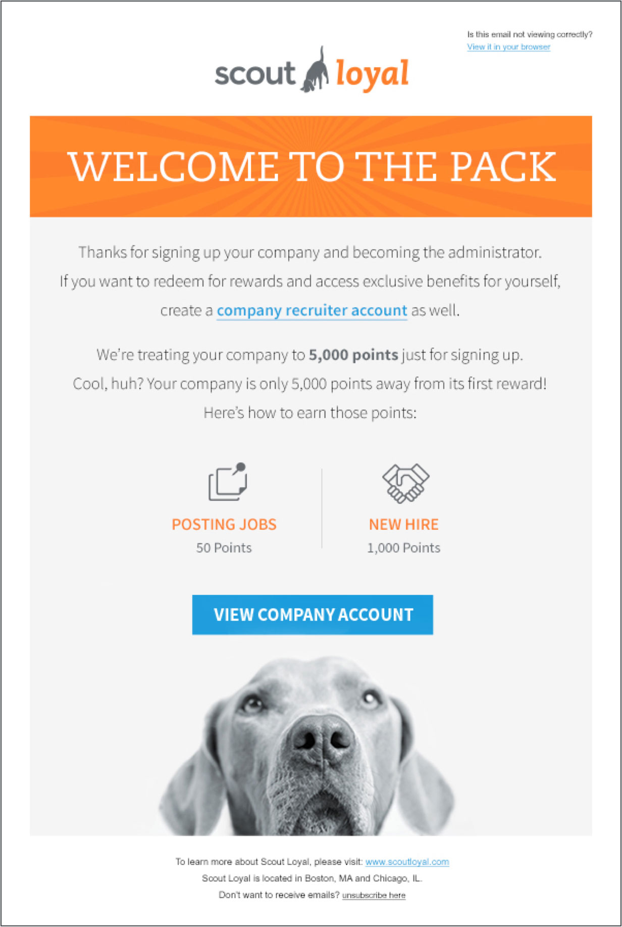
Pre-launch, launch, and post-launch emails were developed to introduce and maintain engagement in the program.
The client also requested a few print materials to support the launch, including a step-by-step guide that instructs how the site works, a loyalty card, and postcard to spread the word.
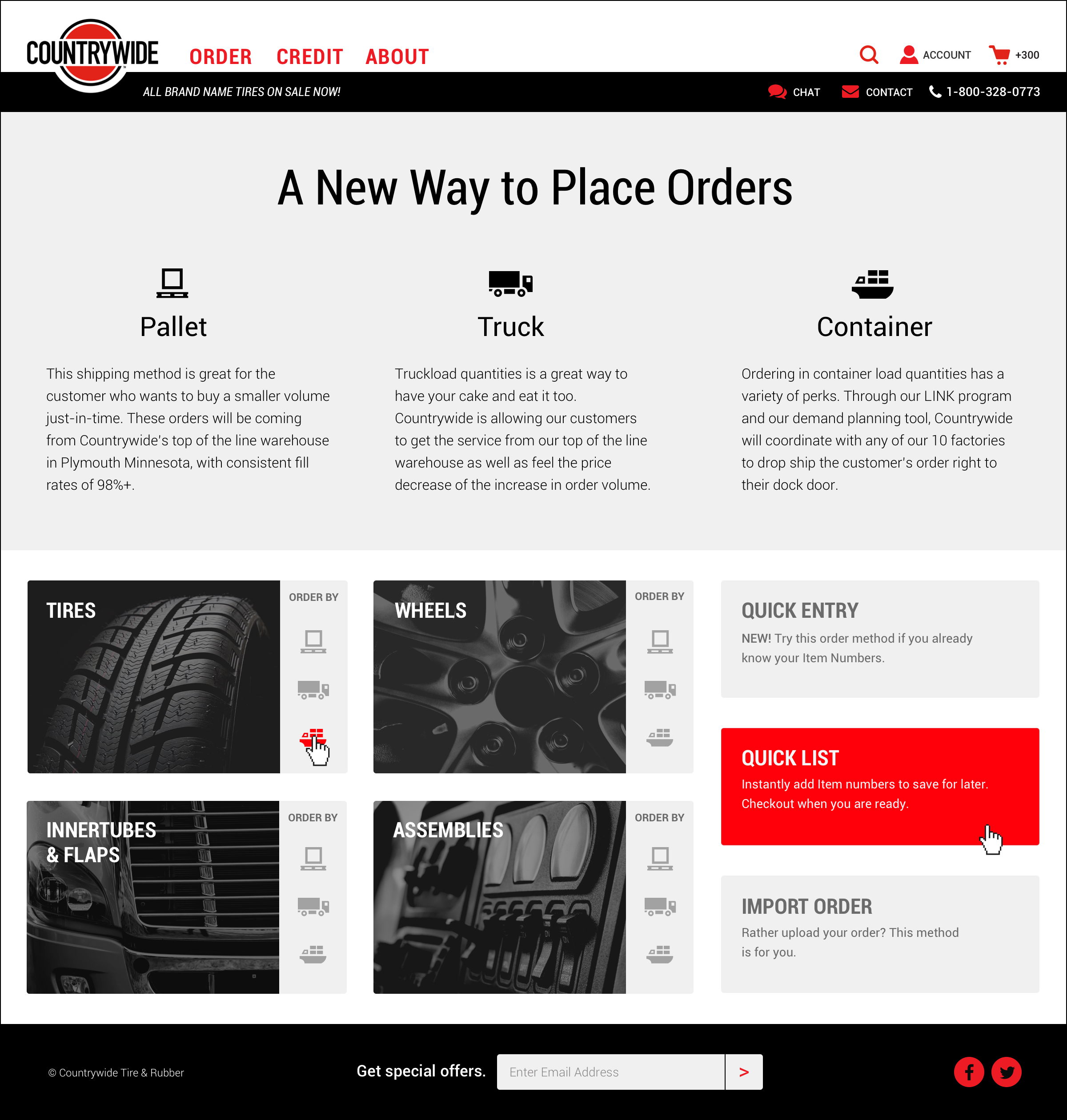
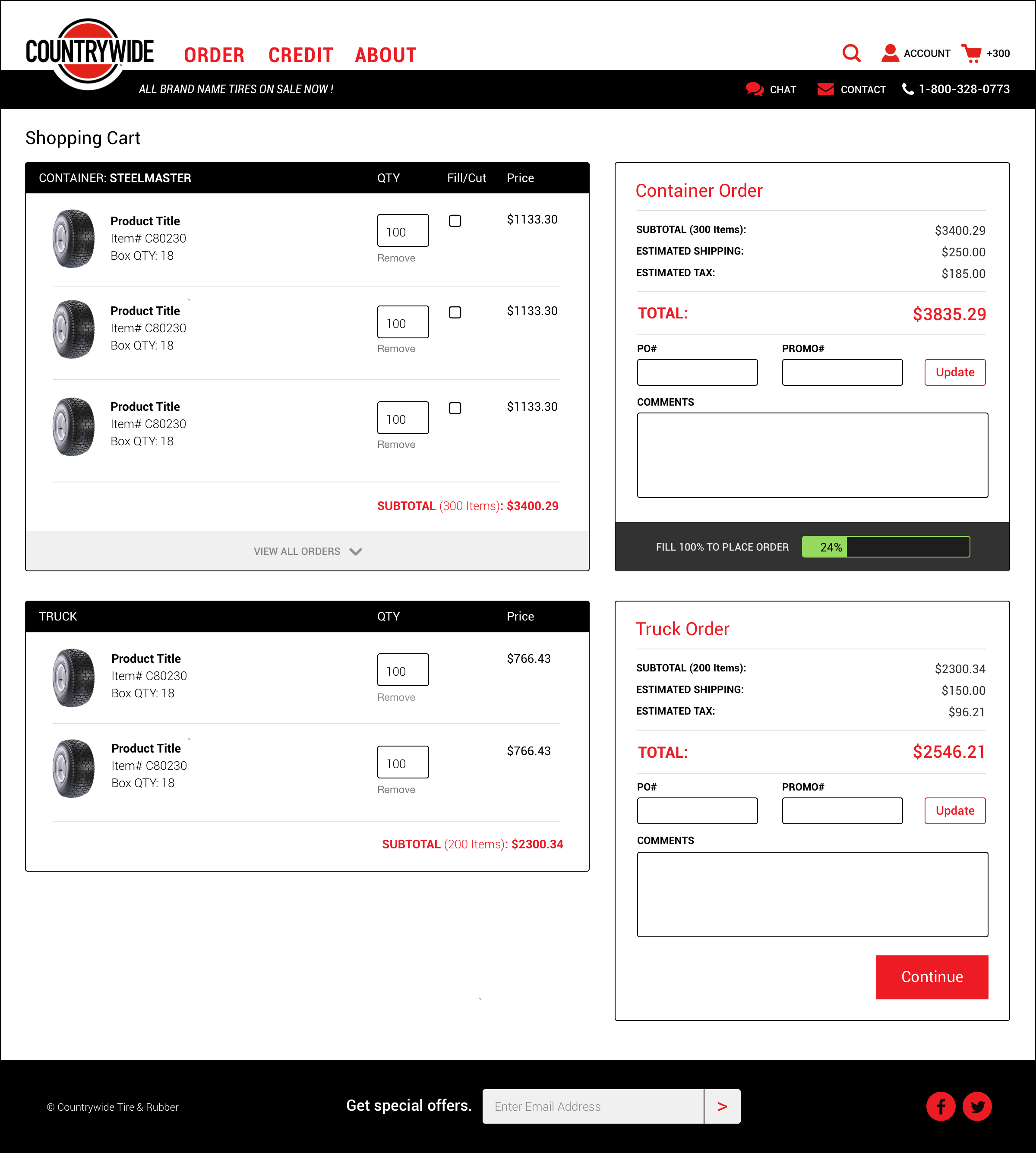
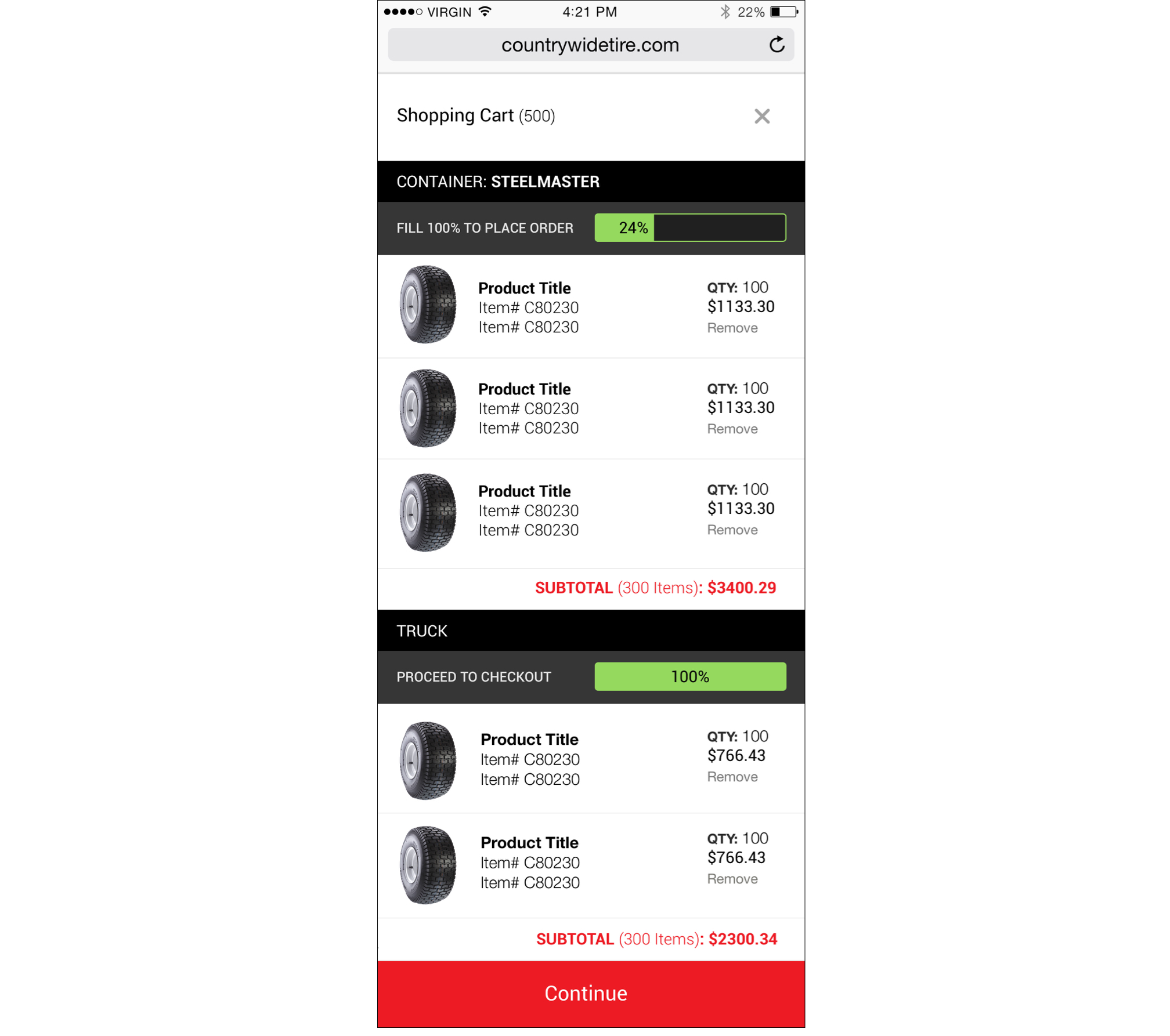
Countrywide needed a new ordering system + redesign for their B2B site. Customers were previously limited to smaller orders by the pallet. In response to market demand, they needed to find a way to expand their ordering capability for larger quantities, such as by the truck load or shipping container.
I worked with the business owner to revise their intial strategy, created sitemaps, wireframes, mockups, and final layouts. I sourced and collaborated with 2 engineers from my network for the front and back-end. All work was done off-site with the exception of ideation sessions with the team.
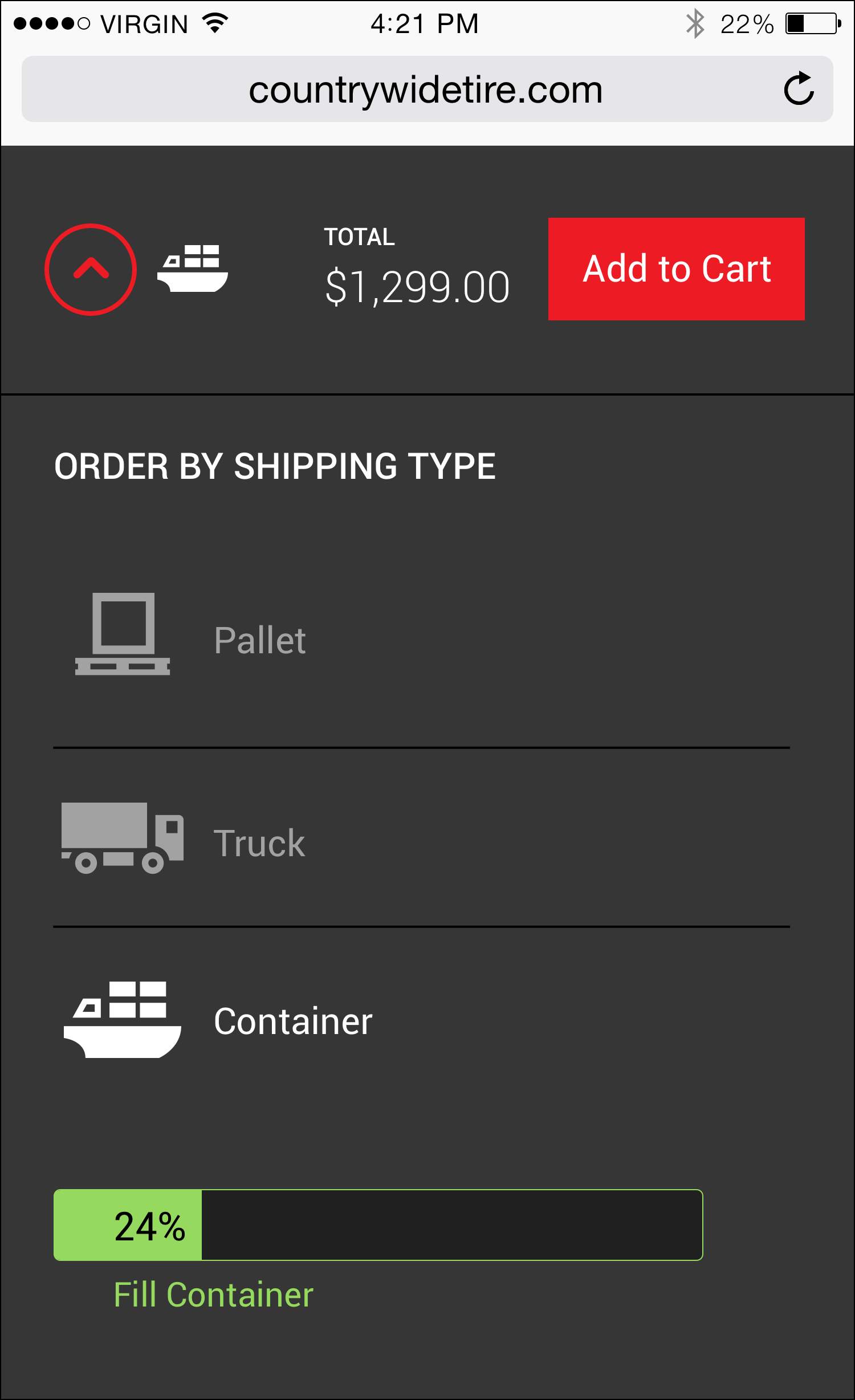
The site is meant to primarily work with registered customers. Visitors can explore the company offering without revealing price-sensitive information. Once logged-in there is access to features that allow customers to quickly narrow their search results. Other features include a progress meter that tracks truck and container orders, a quick list function for saving item numbers, and advanced ordering options for repeat customers.
The work that came out of this project was a game changer for the business. They significanly extended their market reach by offering higher shipping quantities and direct-to-vendor relationships with their customers. CWT&R originally envisioned separate systems for each ordering type (pallet, truck, container) but our team was able to make a case for a single ordering system that can adapt to their customer's order preference.
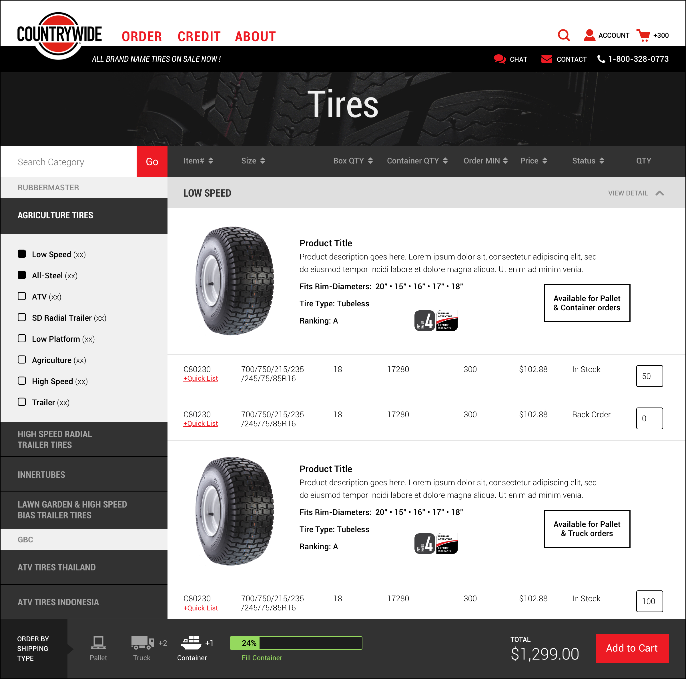
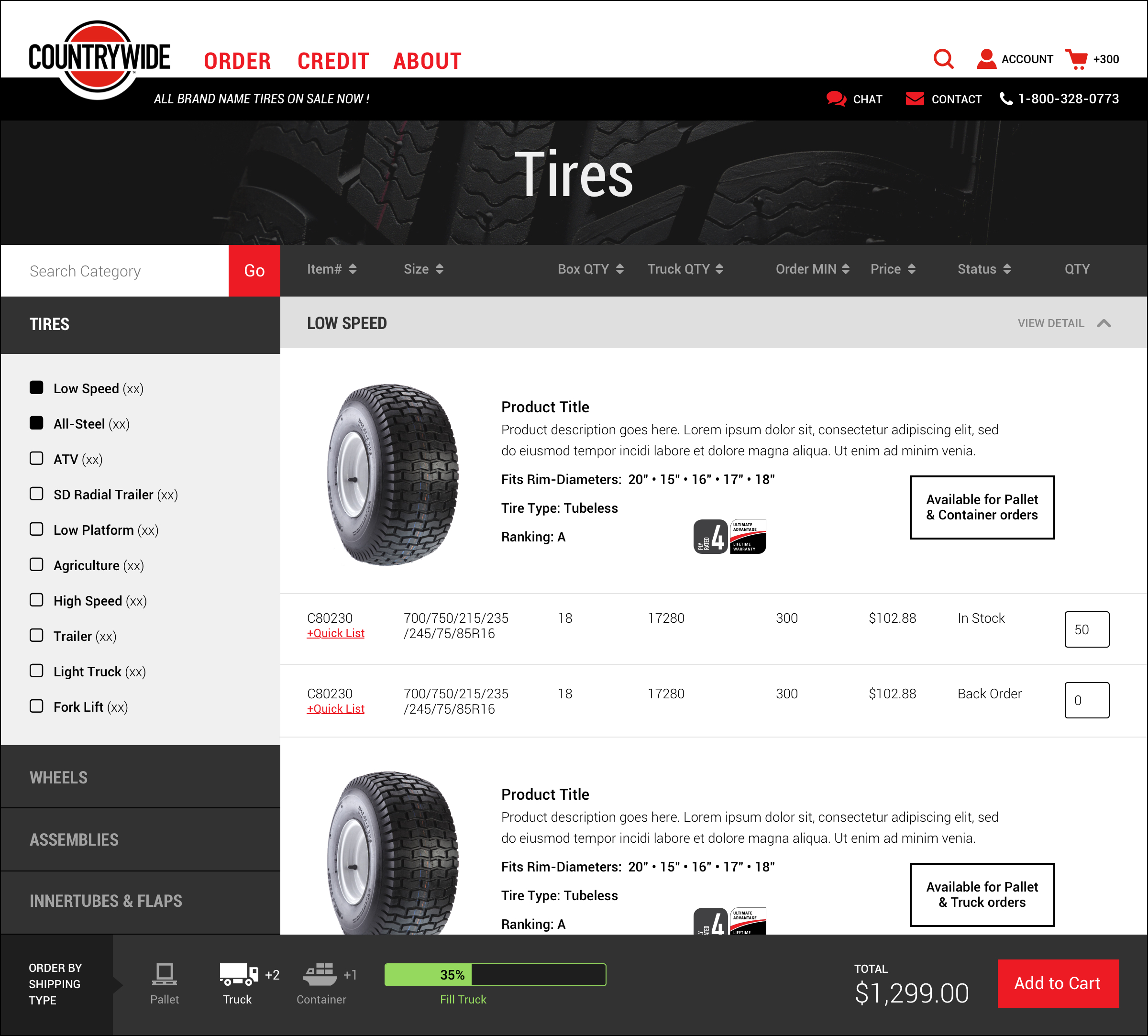
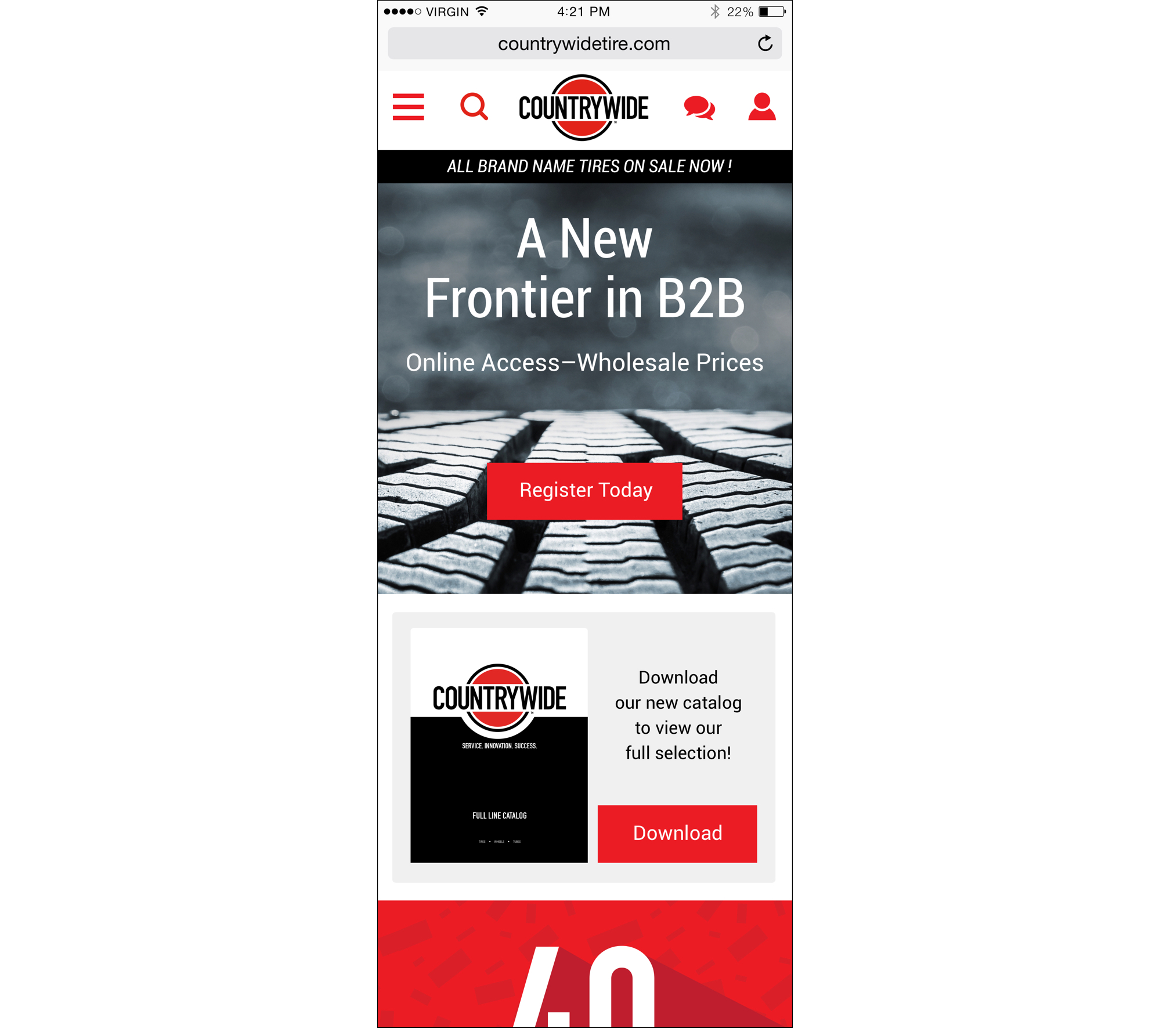
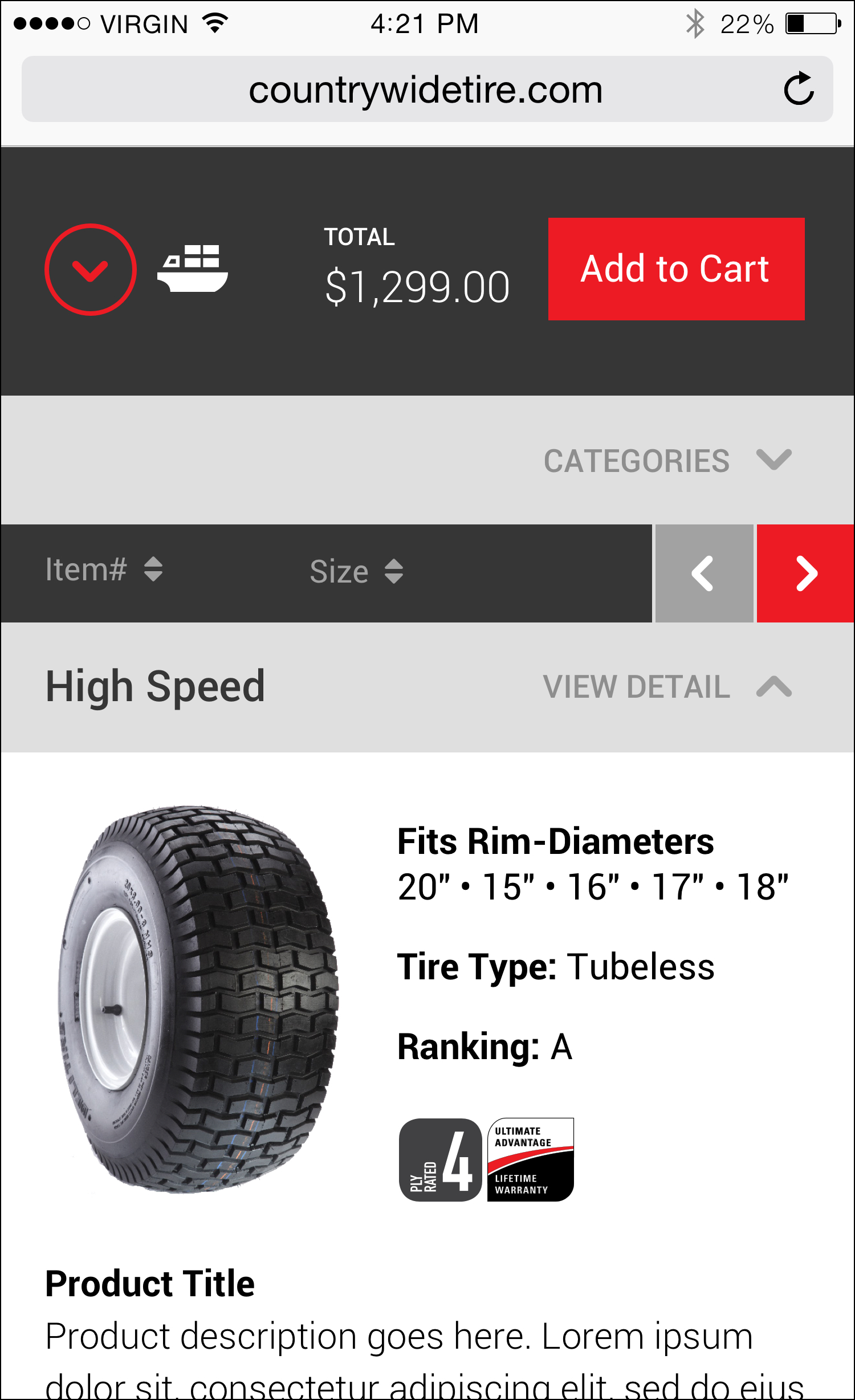
The system was designed to be completely responsive. The ordering process adapts to work in mobile environments by making good use of side scrollers, drop downs, and pop-ups.
Feel free to setup some time by getting in touch through the contact form on this site or email: ctetro@chrlieco.com
Organizations that handle customer cardholder data need to stay in compliance by safeguarding sensitive payment card information, such as credit card numbers and authentication data. In order to achieve this, a range of security controls need to be maintained, vulnerabilities assessed, and adaptation to changes in technology and regulations.
LogRhythm didn’t have the best system to achieve compliance. They needed a solution that was not only intuitive but offered far better functionality for building out reports for assessments and audits of systems, networks, and processes for external audits by qualified security assessors (QSAs) or internal audit teams.
I was the lead on this project collaborating with several subject matter experts, product managers, engineering, research/usablity sessions, and regular critque with the design team.
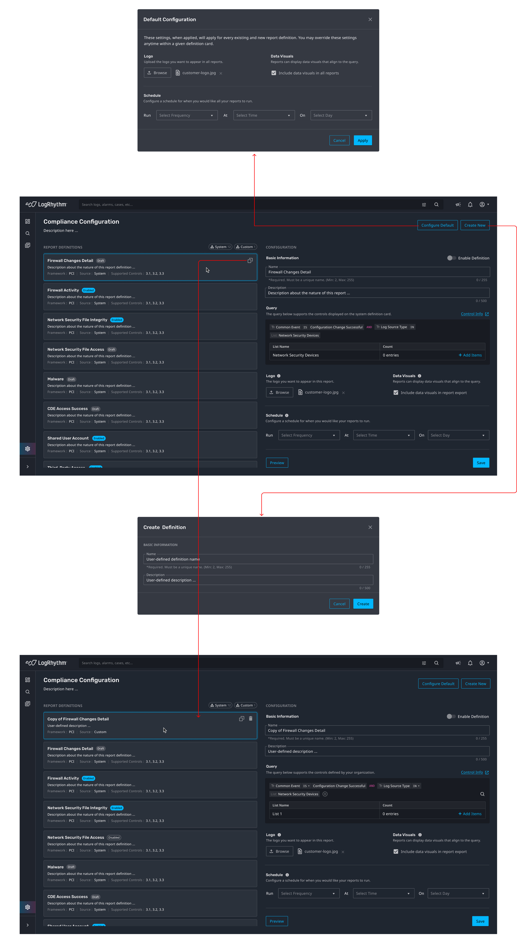
The old system had users navigate through several areas of their software in order operate the compliance features. With the new approach, we consolidated all that functionality into one screen. This is a very complex feature and there's a lot that can be said here. Essentially, we introduced the ability to configure system settings and reporting based on PCI DSS requirements. Addtional parts to this experiece, that are not shown, includes a data dashboard, report outputs, and list management.
There’s a lot more to show, including some of the explorations we designed as well as how our research influenced the thinking + features that went into this redesign. Feel free to setup some time by getting in touch through the contact form on this site or email: ctetro@chrlieco.com
Pearson was grappling with the obsolescence of textbooks and an ineffective educational model. Students were increasingly disengaged, resorting to shortcuts, and questioning why learning can't be expedited. There was a desire for streamlined learning experiences that prioritized time and planning.
The end goal was to develop an app that facilitates quicker learning while ensuring that educational technology, like AYRA, enhances both teaching and learning efficiency.
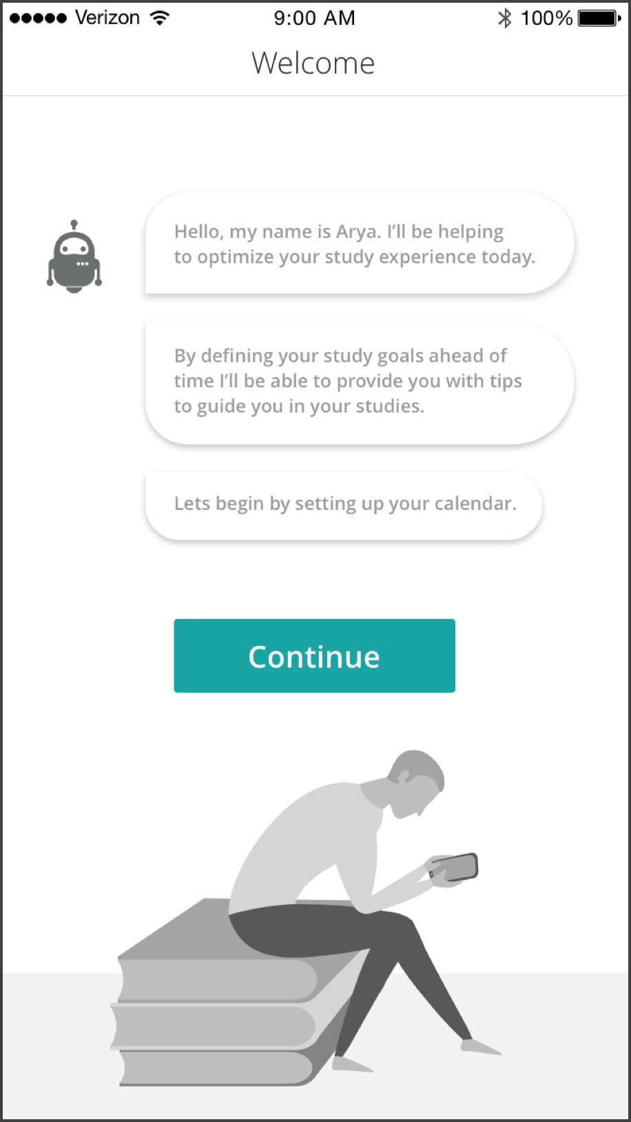
This project was being developed under an R&D envrionment and I was the sole product designer on this one. It was canceled before we could reach the design and development phase, but showing the hi-fi wireframes anyways since there’s some thinking that I’d like to share with the world!
Students crave data-informed learning processes, wanting to eliminate distractions that hinder their progress. To address these challenges, the focus was on understanding and addressing real student concerns around learning, especially as it relates to time management and learning efficacy.
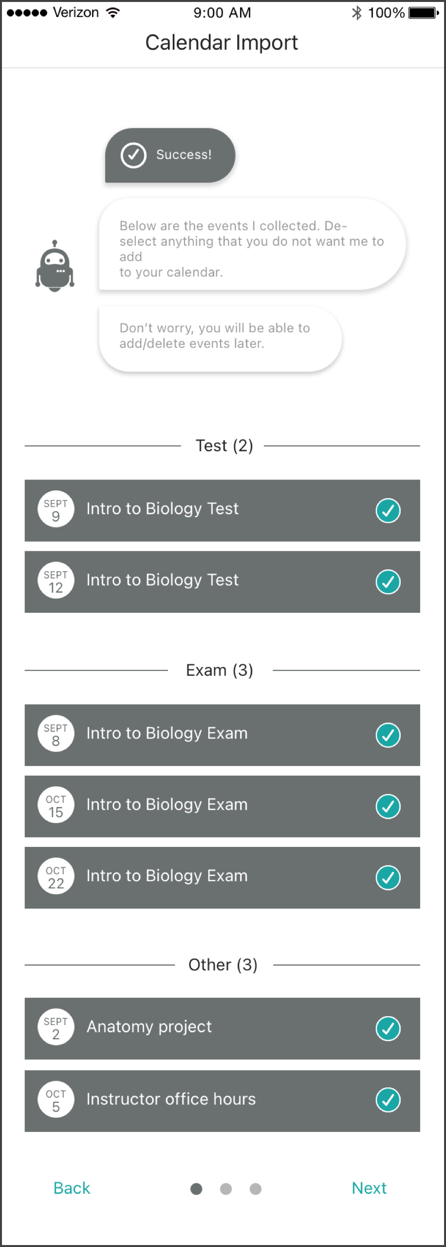
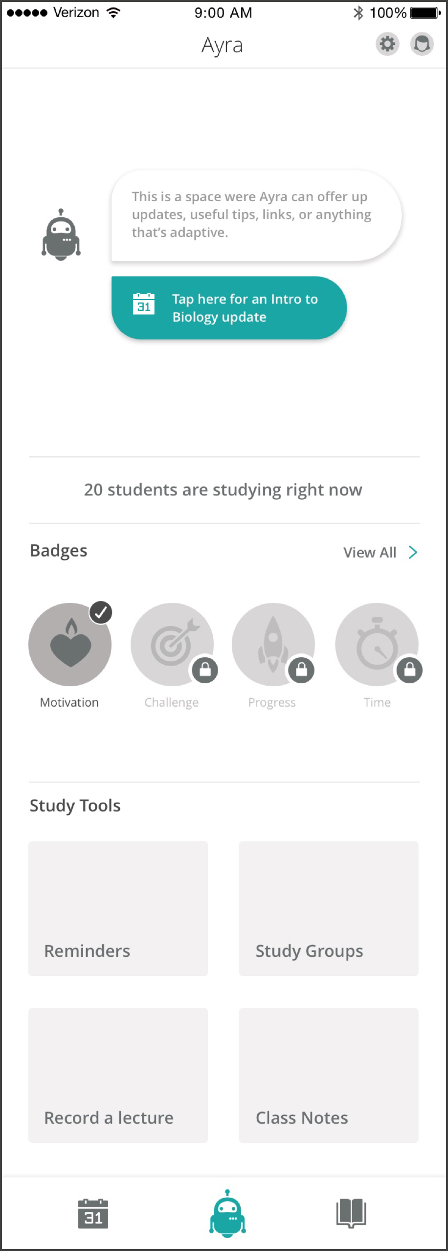
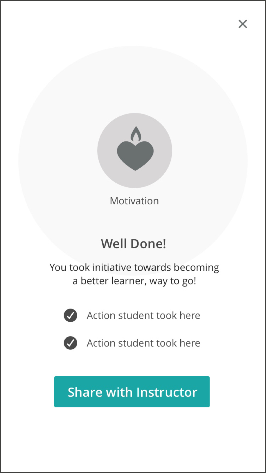
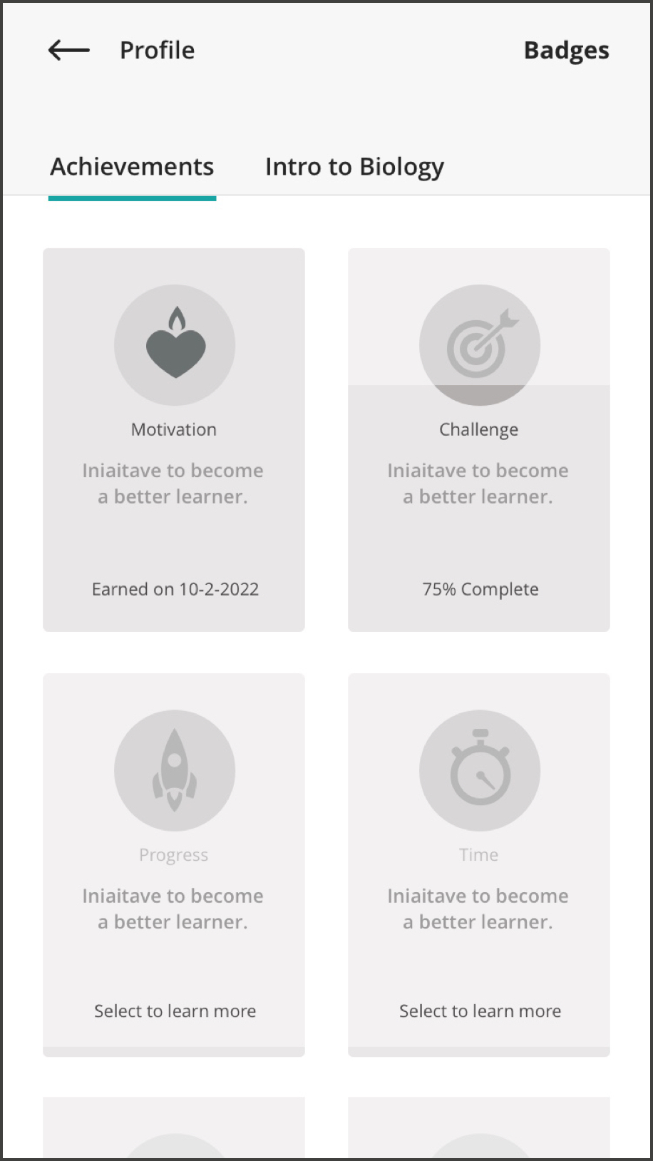
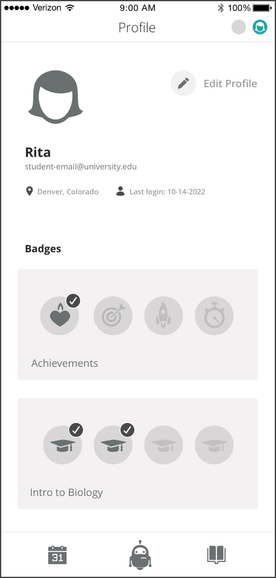
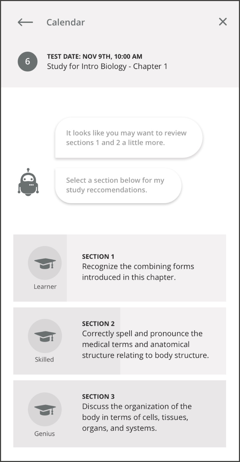
There’s a lot more to show, including how some of the usability testing performed influenced the thinking + features that went into this app. Feel free to setup some time by getting in touch through the contact form on this site or email: ctetro@chrlieco.com
Starz sought a thorough redesign and marketing overhaul for their logged-out interface across web, mobile, and 10FT (television) platforms. Their current customer acquisition rates fell short of expectations, prompting the necessity for enhanced discoverability of content per asset. Additionally, they aimed for a refined marketing strategy to effectively convey their promotional offerings with clarity and precision.
I was the lead on this initiative and orchestrated collaborative efforts with a designer, researcher, several engineers, and the product manager. Employing a structured approach, I organized ideation workshops to foster creative exploration with the team, supplemented by usability assessments and A/B testing conducted in collaboration with our dedicated researcher and an external partner.
We were given a fairly clean slate in terms of requirements for this request, the only real objective was to increase subscribers and retain them. With such an open slate it was challenging to determine where to start, so I facilitated a few ideation sessions with the team to explore what we could achieve. We landed on exploring ways we can better surface our content, remove the misleading marketing tactics and replace them with more transparent, upfront offers.
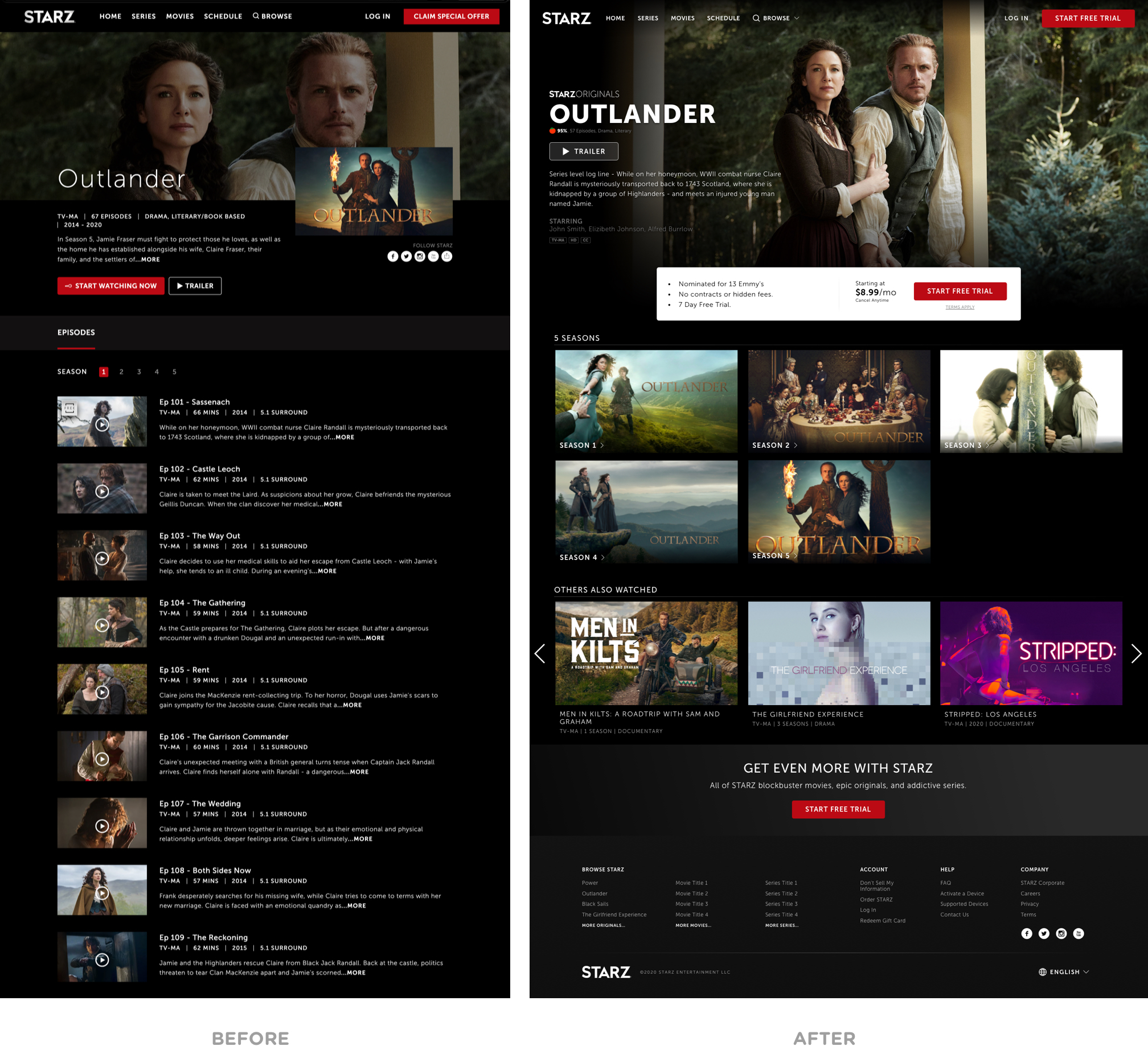
The end result ended looking something like like you see below. We gave our asset detail screens a modern look, bolder fonts, more content upfront, all backed by a refined marketing strategy that doesn’t hold back on the company’s value offering.
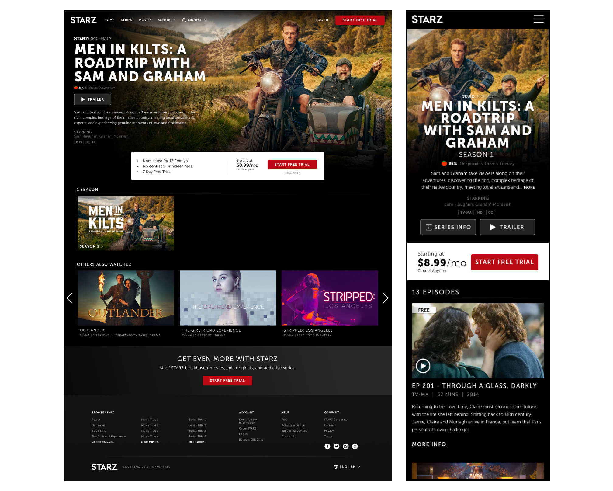
There’s a lot more to show, including some of the explorations we designed as well as how our research influenced the thinking + features that went into this redesign. Feel free to setup some time by getting in touch through the contact form on this site or email: ctetro@chrlieco.com